
Bigg Boss 19: Daily Discussion Thread- 1st Dec 2025.
Bigg Boss 19: Daily Discussion Thread-2nd Dec, 2025

FAKE FIGHTS 2.12

Samantha Ruth Prabhu And Raj Tie Knot
Yrkkh gen 3 feud - new low 📯
Dhurandhar - Advance Bookings Open

📚Book Talk Forum, November 2025: Reading Challenge Results📚
FAMILY TREE 3.12
Era defining superstar Vicky Kaushal!
Ranveer Singh Apologises
Tribute To Legacy
What made you guys start watching?
Downfall Of Govinda
🎄 Elves of the Bookshelves 🎄 | BTRC • December 2025
Journalist talks about experience interviewing Kriti Sanon
🎅🏼 Santas Of Storyland 🎄Dec 2025 Book Talk

2nd December episode Discussion thread
🌟Gingerbread Page Turners 🎄BTRC December 2025🌟

The days of friendship and love Season4 SS IshVi RishRee

🏏South Africa tour of India 2025: India vs SA - 2nd ODI🏏
Initially I thought I might take time to adjust to this new change. And I'm very well aware that the developers might be thinking the same that people will gradually adjust to the change.
However, looking at the pages is giving me anxiety. It is so jarring to look at. I feel strain on my eyes.
The previous layout had no such problems. It was quite easy on eyes.
The only change I liked in this update is increasing the number of topics/ threads on a page.
Please do something to make pages easy on eyes.
Want to highlight the newfound issues againOriginally posted by: WaveTeal
Hello team, congratulations on testing the new UI.
I encountered a few issues after the new UI update -
1. When clicking on the notification for tag, previously it redirected to the post I am tagged. Now it's stopping on the first post on the page. We need to scroll to find the post thus eliminating the basic purpose of tag/dm/ notification. **SEEMS TO BE FIXED**
**This is crucial as if I am tagging someone or am being tagged on the very bottom of the page, I might scroll past it. Positive that it will be fixed with caching.
2. Similarly to tagged posts, when I am clicking notification for XYZ has liked my post, it again stops on the top of the page (doesn't redirect to the post the member has liked) ✅ *** FIXED ***3. Same with inbox hyperlinks. I have to scroll to find the post even though the sender has linked the specific hyperlink. **SEEMS TO BE FIXED**
4. Loading time has increased subsequently.
5. Too many distractions.
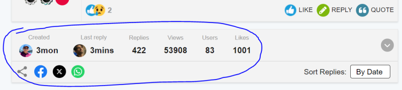
6. The differentiating colors are either too contrasting or non-existent. Example - read or unread PMs/Notification7. The reading area(body) has been narrowed down to an excessive level. While there is too much empty space on the right side. (from desktop)
8. Clickable contents showing Typing Cursor ( | ) instead of Mouse cursor ➤
9. Logout option is not visible under forums, have to go to my posts in order to view logout.
10.
Needless to say, the UI looks quite outdated and claustrophobic. The neatness is gone. If possible kindly revert back to the previous clean interface while keeping the useful changes🙏
This top info part in the middle of every page is an overkill. On the very first page of the thread is sufficient IMO. Or kindly move it to the bottom where this doesn't break the flow/act like a distraction.
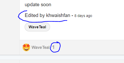
The 'edited by' is hideously big, needs rescaling. ✅*** FIXED ***
The part where only one person has liked, no point of indicating the number "1" - if it's a glitch hopefully gets removed.
The features which are useful so far is the new sorting by dates and likes.
And the "expand" option for quotes - loved it for long quotes. BUT - Needs a limit of 5 lines minimum to get the expand option to work. Otherwise just extra clicks and inconvenience for shorter posts.
For now, noticed these. Might update if I encounter more bugs/issues.
Regards. 🌸
The new interface for mobile users is facing a fair bit of flak (and rightly so), but it's not half bad on the desktop/laptop btw.
But the vast majority probably browse IF on their phones- guess the ratio of phone to laptop users would be something like 80-20?
Exactly, i don't know anyone who uses IF on laptop, everyone watches on phone, so they should make the interface phone -friendly.
Originally posted by: Basskarrr
Vijay bhai … the things you consider small changes in UI have huge impact on our user experiences. Here’s what is different for me on phone
1) Font sizes small and blurry, too many posts, info, links squeezed in one page make it cluttered and smaller - the previous one was spacious and easy on my eyes
2) Quote box is rectangle again impacts UX - it is not pleasant to see or engage with
3) Post option setting colour used to be Red now it is Grey. That doesn’t give my eyes the break it needs. Everything in post box is grey - again not pleasing for user
4) Post content and signature are now so close together that there is no break for eyes
5) That info box who created post, time, last post - is adding to an already cluttered page
And I can go on. Your members are feeling a difference.


Hi All, First off, a huge thank you to each one of you! Your active participation and enthusiasm continue to shape our community into a vibrant...


 Anupamaa
 Ek Duje Ke Vaaste 2


1.5k