
Bigg Boss 19: Daily Discussion Thread - 27th Nov 2025

SAASS & BAHUS 27.11
PYAAR KI KAHANI 28.11
Yeh Rishta Kya Kehlata Hai Nov 27, 2025 Episode Discussion Thread

Dharmendra Celebration Of Life Prayer Meet
Saraayah Malhotra - Sid-Kiara s Baby name 💖
EVICT ASHNOOR
Hrithik Roshan is over & out?
Yeh Rishta Kya Kehlata Hai Nov 28, 2025 Episode Discussion Thread
Deepika’s flop brand 82°E reports loss of 12.26 crores

Vrinda Angad Marriage
Bigg Boss 19: Daily Discussion Thread - 28th Nov 2025

How Embarrassing
What's wrong with team Dhurandhar? Such lousy promotions man!
Tere Ishks 2-week condition shrinks Dhurandhar’s show count ?

🏏Women's Premier League Mega Auction 2026🏏
Ahaan and Aneet new video
I mean I couldn't agree more
The previous one looked way more modern than this
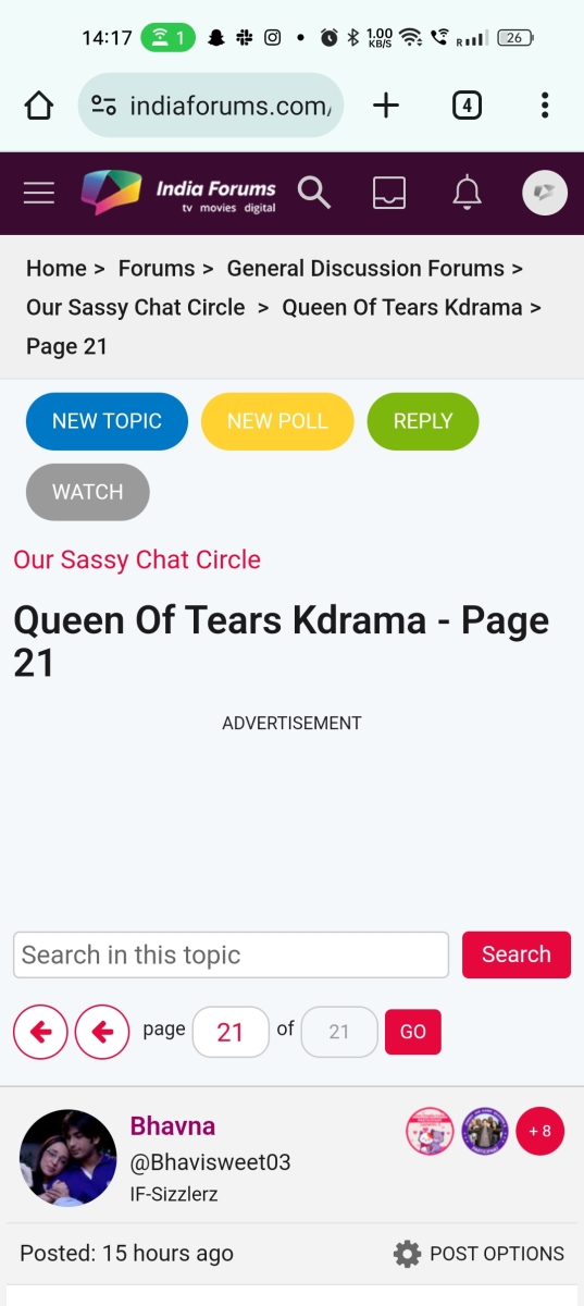
For eg with this page
Since the right side (last reply) doesn't have enough content top alignment looked better here cause center alignment gives a sense of too much empty space
Showing hyperlink as an underline blue color is like the default css that's almost never seen on websites since ages , the previous one with slightly bolder text and an arrow looked better
Also currently the hyperlink css editing comes on the username (bad UX) it's counterintuitive , is it supposed to take me to the user profile or the last post on the topic
Also the popups for likes for a post a) look cluttered with a lot of user info that was probably not need for it badges their seniority level and other info , name and username would have been sufficient information , b) it's not really responsive (as in adjusting to the screen size ) almost takes up the entire screen on my phonr and I noticed an unnecessary horizontal scroll
While I like the expand feature for quotes absolutely hate the implementation
I see expand but no collapse thought clicking on the block again would do the trick but no it doesn't
I see expand on posts which are one or two lines , it should have expand only for post greater than 5-6 lines
Also the expand button as pill here covers up a part of the text so sort of forces you to expand even if the post is a line long a much simpler approach would be to do it the way Instagram does it for it's post extra text as ..... and when you click to the end of text it expands or collapse
Another
Or a down arrow instead of expand (no pill or circle or extra css for that) which changes to up arrow on clicking giving expand collapse functionality as mentioned earlier there should be some margin between the expand and the actual text so there's no overlap. Also I find the gradient on the quote really unnecessary
Will have more suggestions when I have had more feel of the new UI
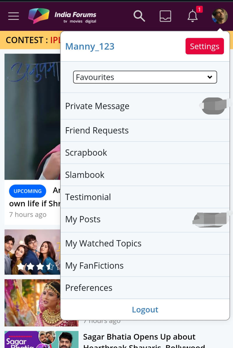
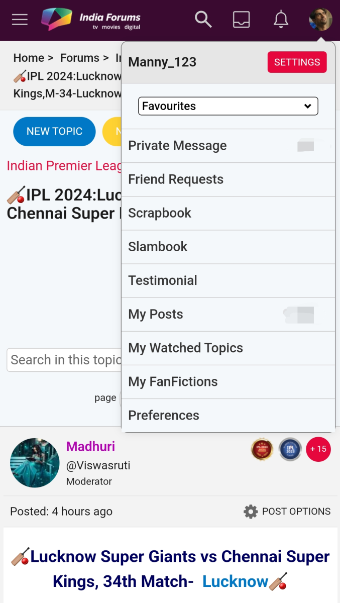
Originally posted by: Manny_123
Hi Mods,
Logout option is available when I go to homepage. I don't get the same feature while I am on a forum.
Can we not have these text here bold , too much for the eye I like the new settings button sans the darker color ,logout is gone now
Originally posted by: firewings_diya
Hi,
I will just add all the issues that i see in this comment. It may or may not have mentioned previously.
1. Emoji clicking is not working.
2. Clicking on last page number is clicking somewhere else so we have to use arrow mark to go to next page.
3. We no longer have an option to select posts in forums if we want to delete them. Not sure if it's not visible or it's missing.
4. Please modify the color between unread notification and read notification as it's hard to distinguish.
5. Private forums message to say it's private is missing. Now it just shows global posts and blank space.
6. Can there be a option to select for user to decide which layout they want 1. posts with expanded 2. small window with expand button.
7. Report button has issue.
8. Settings button on private forums are not working.
9. Section to display managers is missing.
10. For some reason quote and edit button taking clicks around it
B is button so every click is highlighting 3 square blocks around it. Whernever we click that area it clicks button.
I^^^|.....
| B
| |^^^^
11. Unwatch button is not working.
I will update this list as in when i find something new.
For Post settings the icon color is too off such a light grey that it looks like it's disabled also what's with this bright popped out red pains my eyes ...the report flag is too small the link icon is too big on post settings also the size of that pop up looks weird should've some margins between the content and the box
Originally posted by: Sutapasima
Dear friends. IF was working on old version of html... the site has been recreated using latest version of html /css.
We do have to keep abreast with the changing times .
Please give some time to technical team to fix the bugs/ change the issues.
Are you sure it's the latest though suta I see a whole loads of things that are outdated in terms of UI/UX and maybe use a newer framework if the UI was being rewritten anyways
Another suggestion is to rollout such big changes in phases so that users get time to adjust and give their feedback and the devs behind the glass to solve the issues , there are so many bugs and fixes here I'm starting to feel bad for the dev here
Originally posted by: trouble_006
Html/CSS version update has nothing to do with design/UI changes
Could have easily kept the earlier theming while updating the tech stack.
I think it's the other way round ...IF ended up updating the HTML/CSS files instead of the tech stack
Why such a big bold font for topic and forum navigation
Alternatively when I click of reply it sort of takes me to the previous look of it which was so much better smaller normal text
Why is there a need for new topic and new poll option inside a topic that should be for only the forum page
The watch option for most modern website is that of a eye and crossed out eye for unwatch wasn't that the same case with IF can't remember anymore
Please go back to the previous font weight not everything on the page needs to pop out

Agree about the hyperlink on usernames . (Edited to add - they have now removed the underline)Originally posted by: DevilHere
Also currently the hyperlink css editing comes on the username (bad UX) it's counterintuitive , is it supposed to take me to the user profile or the last post on the topic
Also I find the gradient on the quote really unnecessary
Bold: so I was not wrong. There is in fact a bad gradient and also an outline around the rectangle quote box which is adding weight to it. The quote box was always rectangle … now it makes sense why the new one looks bulky and cluttered, not easy on the eyes - add to it the Expand option
Originally posted by: Basskarrr
Agree about the hyperlink on usernames .
Bold: so I was not wrong. There is in fact a bad gradient and also an outline around the rectangle quote box which is adding weight to it. The quote box was always rectangle … now it makes sense why the new one looks bulky and cluttered, not easy on the eyes - add to it the Expand option


Hi All, First off, a huge thank you to each one of you! Your active participation and enthusiasm continue to shape our community into a vibrant...


 Sports


1.5k