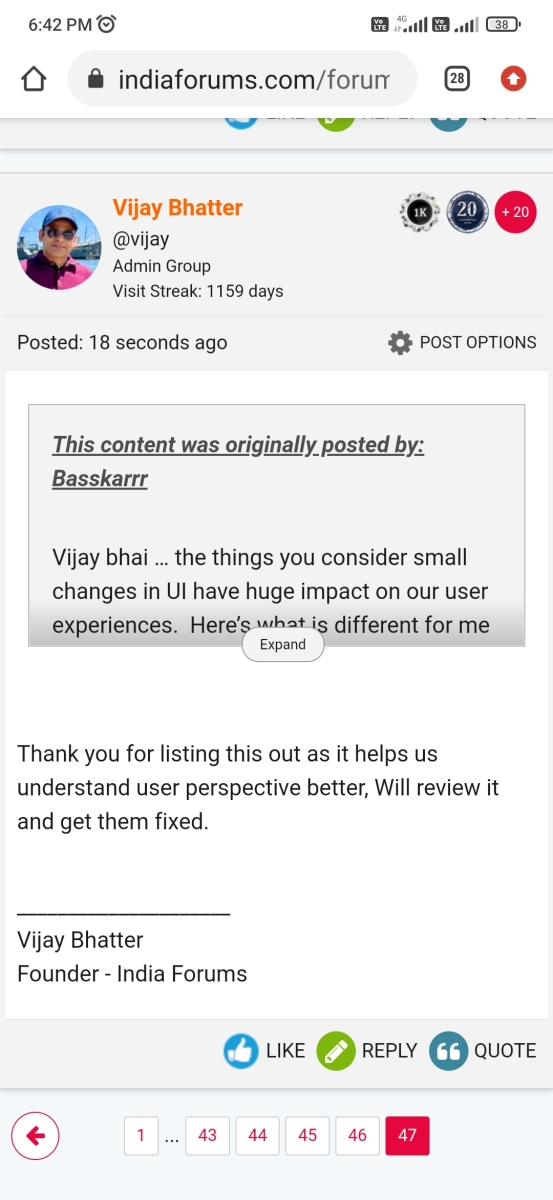
Originally posted by: Basskarrr
Vijay bhai … the things you consider small changes in UI have huge impact on our user experiences. Here’s what is different for me on phone
1) Font sizes small and blurry, too many posts, info, links squeezed in one page make it cluttered and smaller - the previous one was spacious and easy on my eyes
2) Quote box is rectangle again impacts UX - it is not pleasant to see or engage with
3) Post option setting colour used to be Red now it is Grey. That doesn’t give my eyes the break it needs. Everything in post box is grey - again not pleasing for user
4) Post content and signature are now so close together that there is no break for eyes
5) That info box who created post, time, last post - is adding to an already cluttered page
And I can go on. Your members are feeling a difference.


 Health and Fitness
 Music Corner


1.5k