I reserved this on 7th of June and you updated after a week,right? This means I've taken almost a month to edit this,it is July now,ain't that shameful now,especially when the update is so beautiful? Certainly it is and a well-mannered human being must apologies for such an inexcusable and dishonourable act and in repentance must leave a fine comment for the astoundingly awesome update. Here,I'm doing both. First and foremost,I apologies for taking so long to edit this comment that you deserve to have read before.
Nevertheless,I'll do the honors now.
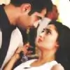
http://i.minus.com/iiS2FhQaO6iRf.gif,this entire GIF set is totally,like totally,beautiful. Well timed and gorgeously colored,this reminds me of something I wanted to tell you,you're coloring or the PSDs,whatever that is,I really admire 'em,especially the concocted brownish hue. You've been using it a lot lately and I adore it a lot,as I mentioned before. The ones with the bigger size are almost the same,for 'em I'd say I like the size you've chose,they look very fine.
http://i.minus.com/jNM1WjVNCSh3z.png,is unique,you've tried a new style for this particular signature,just like the name of your shop,ingenious it is. You're always coming up with anomalous ideas and creations which is remarkable. Coming back to the signature,alongside with the style I also like and praise the text.
http://i.minus.com/jmCMaZmgXFBu4.png,as for this signature,I like the abstruse and subtle usage of textures. As far as I know,they're your own textures,right? That makes it even more amazing.
The next signature,the Divyanka's selfie one,is simple but all of your simple creations have to be classy as well,that is like your rule.😆 I applaud the coloring you did on this one.
http://i.minus.com/jfVfS4nMILM09.png,the little bit dark and brownish coloring and the text,both,go well with the scene and everything. There are some minor flaws in the blending,however you've still been successful in creating a pretty signature.
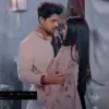
Next,Karan and Divyanka's solo signature,both of these creations are pleasant. However http://i.minus.com/jbrmb6jBSmD3lw.png,this one could have been really better if it wasn't stretched or you had used another coloring.
The Siddharant and Sherlock's stuff are satisfying and appealing. Good job with those.
Now comes the highlight of the update and the masterpiece, http://i.minus.com/jmgHpqELCyZAY.png,this.😳 For icons,it is all there in the cropping and you've nailed it,like always. Each and every icon has been meticulously cropped and you know what is even more astounding? Yes,the coloring. It,the coloring,is exceptionally spectacular. Tremendous,and now I can't say more,flabbergasted.
http://i.minus.com/jb0ntiXwwg0nAb.png,this could have been unblemished,if you wouldn't had opted for that text style,I know you tried something different which matters the most but it really didn't work,you see. The signature and the overly exaggerated text do not really adjust together. You;re getting me? Otherwise I like the way you've kept it simple and also the coloring,which I always do.
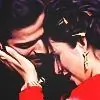
http://i.minus.com/jbrYYVrKp8aChr.png, this one as I've told you before is exceptionally brilliant,like seriously.The text,the usage of texture and coloring,everything,I swear,everything is amazing.😳 I really don't get it,how you do all of this? Such perfection.
I'll not comment on my or any requests,as you've,like always,succeeded in making me go speechless but woman,wait,you made those Sonakshi's icons?😲 They're perfect and what precision woman. Look at the cropping,just look at them,and you're mind blown,as if somebody has cast some spell,they're miraculous and spellbinding and may I add,wondrous as well.Er,😳
Amazing.Jeez.
Take care and try to update soon.🤗
-Somaiyah.
Edited by .Enigma. - 11 years ago


 Kyunki Saas Bhi Kabhi Bahu Thi 2
 Current Affairs
 Anupamaa
 Hindi TV Shows

