{VishaGlitZ #5} SWARA/SKR/BOLLY/AVIS/REQ- PG52 - Page 23

Created

Last reply

Replies

443

Views

23739

Users

90

Likes

1189

Frequent Posters

FromTheAshes thumbnail
Posted: 8 years ago

Originally posted by: VishaD.


Yes, coming by today πŸ˜†
Requests are still in process though. I thought of doing 2 versions for each. So requests would be door delivery when i'm done πŸ˜›

door deliveryπŸ˜†
VishaD. thumbnail
Anniversary 16 Thumbnail Group Promotion 8 Thumbnail + 7
Posted: 8 years ago

Originally posted by: .LilGreenRobot.

I missed like half of gallery #4 

I'll be back to edit this comment and it'll be very long. Last day at work today for 2015. 

I've missed your work. πŸ₯Ί

Edited.
------

Firstly , welcome back and my gallery also missed your comments πŸ˜ƒ

Okay so this is where I've missed your updates from:

Gallery #4 page 91:

http://i.imgur.com/4sBWCmN.png - I love the way you've captured their emotions in this. Beautiful colouring as usual. What stood out about it is how you've managed to use an orange/yellow colour for the font which matches very little background of the sig & even though you placed it on a purplish back, it still doesn't disturb the whole look.

This was actually a dark scene and i was happy with the bright outcome 😊

http://i.imgur.com/iogMAVC.png - Beautiful bright colours. Removing the background of an image is extremely tricky but you've done it impeccably well with Gayatri's picture in the bottom left corner. You've done a great job with the highlighting because you used the correct amount not to overshadow their faces and managed to make the bright greens and yellows subtle enough to fit in.

You noticed it na πŸ˜†
I agree that its hard too because at times while trying to blend them, it somehow doesn't looks good. Hence remove the background.


http://imgur.com/EuW4m8n.png - Looks a little bit grainy in some portions but the blending is good. Didn't like the yellow in the bottom right corner, didn't go well with the colours of the sig in my opinion, but the mixed fonts cover up for everything.

Yeah because i had a kind of texture that gives that grainy texture but also makes the image a brighter feel. I like how you pointed out. I think it was part of the scene , i don't remember now though πŸ€”

http://i.imgur.com/mMhdBpc.png - The blue and white effect on this is gorgeous! I can see it was night time during the scene πŸ˜† and making dark scenes look good is a difficult task (for me, clearly not for you πŸ˜†) .. You've made the sig strike out with the use of the simple colours. Lastly, the text is placed perfectly in the sig. It catches the eye and still doesn't cover up anything else around it.

http://i.imgur.com/FPFvAmP.png - Definitely me favourite from this update. The blending is perfect. Not a lot of effects used on it. Perfect choice of pictures and the text fits perfect as well because it just explains the sig itself. I love it!

This show has a different kind of coloring and coloring caps from this show was itself a task πŸ˜†

http://i.imgur.com/h9HrmOd.png - The simplicity of this is beautiful. Lovely colours used and nothing that shouts out from the sig. You just left his face as the main attraction and it worked.

http://i.imgur.com/lVT1CFw.png - This looks icy. As in, the blue, grey and white work well together. Loved the way you've used a black and white effect on one of the pictures, looks really good, especially placed against a coloured background.

Yes, it was actually kind of blue but changed the colors towards purple and made it looking subtle.

http://i.imgur.com/qAXow0K.png - Gorgeous earthy colours used. You've made a beautiful sig just by using two pictures.


----------

Gallery #4 page 99:

I just realized you went back all the way to 4th Gallery, page 99 😲

http://i.imgur.com/uDAqkDz.png - Let me start this off with my favourite. The blending on this is amazing! I love everything about especially the colouring. 

http://i.imgur.com/2kLR60j.png and http://i.imgur.com/99DnomO.png - The layout on these two looks very similar so I'll just compare and contrast πŸ˜† .. They're both very simple which is what makes them stand out. I loved how you've used some sort of background/effect with the ETR2 sig, to give it some colour. The green really matches with the black. The second one is beautiful too and I see you only fiddled a little bit with it because it's bright and colourful itself. What I loved the most about this is the way you've used both pictures placing them one on top of the other. Great work on both of these.

I liked the second one more though as its a simple scene, so made it simple and highlighting the event in the scene 😊

http://i.imgur.com/bzELnz2.png - Beautiful blending and I love how you didn't change the colour much. Just let the red colours be the show stoppers. Just one problem though. I can't read the text under the 'i love you' πŸ˜†

Its Bohut Zara Wala πŸ˜†

http://i.imgur.com/T6sbweo.png - New characters in QH?! 😲 .. I love this because of how you've smartly used the purple colour behind the text to give the sig something more than the darkness. Nice work on the blending and great chosen pictures as well. I also like the way you mixed different yet very simple fonts.

Characters simply walk in and out of this show. The guy in this one was supposed to be Season 4 lead but they killed him and transferred his heart into another new lead played by Avinash now πŸ˜•

http://i.imgur.com/Qzi8NbW.png - This is flawless. The colouring is perfection, honestly. I was really sad when their show ended.

I was too but i really missed how things was before the leap. Everything kinda spiraled post the leap though.

http://i.imgur.com/tOcj7rh.png - And he strikes again with his beautiful face! πŸ˜† .. Totally love the background you've used. It looks like he's somewhere up in the clouds, like an angel. A really hot angel. πŸ˜† .. The blue and white you've used work really well together along with the colouring. Again, the simplicity of this is striking. 

--------

Gallery #4 page 106:

http://i.imgur.com/BIIW229.png - You've done a great job with the blending. The yellow and brown also compliment each other.

^^ One of my favorite 😳

http://i.imgur.com/cFtZ1c4.png - This is commendable because I've seen a lot of sigs with this scene and many people (including myself) haven't been able to make the colouring look perfect. You've done a great job with this because you've managed to make the pink very calm. You played around very well with the colouring because most of the time making a sig with that colour can go very wrong πŸ˜† Awesome work!

Actually this is my second attempt. My first attempt when the scene aired wasn't successful. So i think my second inning after one year from the scene got better πŸ˜†


http://i.imgur.com/TAWdGv7.png - Cute! Love the text you've used as well πŸ˜† 

http://i.imgur.com/cUCzoRR.png - PERFECTION. The effect has worked extremely well in this. Loved how you just made his name with the colour & the shadow kind of thing with the text. It's gorgeous.

I hardly like black & white ones but this one would be an exception πŸ˜†

---------

Gallery #4 page 114:

http://imgur.com/sN28TGA.png - β˜ΊοΈβ˜ΊοΈ I don't think there's much to say about this except that what you wrote there is 100% right. 🀣

This was the first one which i experimented with textures and this particular shape and i loved it. Personally one of my favorite 😳

http://i.imgur.com/GG9LM1x.png - I think it's the first time you've experimented with blending and making the whole thing black and white. Or am I wrong? πŸ˜† .. It looks great & I love the little cloud thingy you've placed on the right in the middle. + I also notice the very light blue you've used with the text to match the sig's border.

Actually the whole video was itself black & white. So i felt it was looking very plain, added some texture and a tinge of blue.

http://imgur.com/XB9uWKN.png - Even though there is Nick Bateman in this update, it was a tight competition but this one won. It's my favourite from the update not only because of the song you've used, but also because you've done a flawless job with removing the background from the original picture. The mixture of backgrounds you've used also makes this sig stand out. Beautiful work.

Deepika made it look good though πŸ˜†

http://i.imgur.com/Upy7rZ5.png - This is absolutely gorgeous.

--------

Gallery #4 page 120:

http://i.imgur.com/GvXh0ao.png - Marvelous blending. Even though it looks a little bit grainy and the picture in the bottom right corner seems blurred; the sig itself looks pretty decent.

Personally not my favorite as it didn't come out as what i had in mind.


http://i.imgur.com/YgZEN9p.png - Very nice colours used on this.

http://i.imgur.com/NRfmBr6.png - i love this one. The use of highlighting is outstanding. I know blending with pictures which have a white background can be hard (well it is for me πŸ˜†) but your blending is absolutely great. I've seen a few episodes of this show and I hate the way they made Yuvi who was supposedly the main lead a negative character πŸ€”

Tell me about that. I was rooting for Yuvi and they now turned him into a villain and i left the show.

http://imgur.com/cFmh1rM.png - Amazing use of backgrounds and also the brushes. This is beautiful.

http://i.imgur.com/SwkaVjJ.png - I love the colouring on this. Rusty and very chrome yet it fits perfectly.

http://i.imgur.com/ETmYPCs.png - This is awesome! Loved the picture you chose and the mixing of colours looks great together. 

----------

Gallery #4 page 127:

http://i.imgur.com/LIjE5U4.png - The colouring looks very nice and calm. I know the blending for this must have been tricky but you've done a good job.

Yeah, this was was really tricky and also choosing the right caps since DD was having sore eyes here. So didnt wanted that to be obvious here.


http://i.imgur.com/VxNVCxw.png - My favourite from this update. You've blended so many images perfectly. You didn't play around with the colours much because it looks very natural to me and that's also a plus point.

Yeah, sometimes fiddling too much with the coloring makes the sig lose its essence in my opinion.

http://i.imgur.com/GiJbVW0.png - This is outstanding. 

http://i.imgur.com/DR79Vnl.png - β˜ΊοΈβ˜ΊοΈβ˜ΊοΈ

------------

Gallery #4 page 132:

http://i.imgur.com/RdzpOTn.png - This is absolutely stunning. The colouring looks very soft and subtle, the blending is beautiful too and i loved how you just used a line from their theme song for the text. 

http://i.imgur.com/suWqe2U.png - Great work with this. What really caught my eye is the little play of brushes behind the text. Really fits in and makes the font stand out.

http://i.imgur.com/mUF12Tm.png - Definitely my favourite from the update. Leave the blending and colouring (which is all perfect), but the way you've smartly placed the colourless text over the purple clothing to make it look like the font has some colour to it. The enhancement of the purple has been done cleverly too, you made it stand out yet subtle enough to show the other colours.

You noticed that πŸ˜†

http://i.imgur.com/738gsJR.png - Too much blue, in my opinion. πŸ€” .. I think it would've worked better if the blue was toned down and some of the colours were highlighted a little?

Actually yeah and the coloring of the show's caps itself is more than other shows. So i guess it kinda enhanced the blue more.

http://i.imgur.com/KztKLCj.png - Great use of colours and you've shown their expressions perfectly. Simple yet eye catching. 

http://i.imgur.com/Ugc77Q1.png - Amazing work on the blending and colouring but what I love the most is how you've substituted most of the lights and only left a few which were originally the background of the scene and chose something very different which goes very well with the colours. + very simple text on it works very well. Lets the pictures do all the talking πŸ˜†

True, less image and let their expressions do the talking.

http://i.imgur.com/2UQViUK.png - He's in QH as well? 😳 .. Anyway, this new layout of the sig is nice. I love the distorted placement of the pictures, really makes it stand out. I love how it's just a repetition of the pictures and the little dash of colour behind the text flows well.

Yeah, he is the new lead now. Like i said, people walk in and out of the show always πŸ˜•


http://i.imgur.com/cMj808W.png - Amazing work on the colouring. I never work on scenes like these because there's always too much yellow/gold and I can never get it right πŸ˜† .. You've toned all the colours down perfectly.

Yeah, it was initially very yellowish so tried to toned down the scene.

http://i.imgur.com/dSABROk.png - I love the effect on this!

-----------

Gallery #4 page 140:

Okay, this update has definitely been taken over by Bollywood stuff. 

http://i.imgur.com/8ipb8JO.png - The cropping and removing of the background of this picture is flawless. I love the way you've only used different shades of blue to add to the colour.

I loved how this came out coz the original one was more towards dark and purple.

http://i.imgur.com/BS7GJMc.png - This is sooo cute! πŸ˜† .. Again, great removal of the background. & i love how you've used contrasting colours (pink and turquoise) for this. I've never ever thought that these colours could go well together πŸ˜† .. Great work.

Yes, that was itself a task of coloring the caps and also removing the background πŸ˜†

http://i.imgur.com/S6e50DP.png - Very old school and vintage look to this one. The grey and sort of sepia/chrome colours work very well together. What makes it stand out is how you didn't just use the colour an organized manner, but you just splashed it on leaving some bits grey.

Here i was simply on an experimental mood and didnt mind it looking messy πŸ˜†

http://i.imgur.com/H4GemVP.png - Stunning pic spam! Absolutely love the colouring & leaving it with no text was a good move. It looks beautiful. Definitely my favourite from the Dilwale lot in this update.

Letting the beautiful scenery do the talking instead πŸ˜›

http://i.imgur.com/Yv14bjT.png - This is pretty! Love the smokey effect you've used and also how you managed to make her eye make up stand out but not look dark because sometimes what happens is that when there's a lot of dark colour around a small place, then that section just get covered up when colours are being adusted (always happens to me). The matching of the blue on the text and the streak of blue light look really good too.

I agree as its sometimes difficult to put a color on top something dark.

--------

Moving on to gallery #5 πŸ˜ƒ

First and foremost, congratulations on your 5th gallery!!

Thank you so much πŸ˜ƒ

Looking at the sample work, I've commented on each piece because they're from the previous gallery so you'll find my comments about them somewhere up there ^ πŸ˜† ..

So now... Gallery #5 page 10:

Such a huge update 😲 

http://i.imgur.com/JoFPnsR.png - Great choice of pictures and you've made them look better by the blending and soft effect around them. I love this show. It's the first time I'm watching a show like this and the ensemble cast is outstanding! All of them are superb. Arjun and Mouni make a good couple πŸ˜ƒ

Yes, the show is good and Arjun & Mouni make a good pair.

http://i.imgur.com/1Nluele.png - Again, awesome work on the colour and blending. I love how you've used that string of bokeh lights on the side of the text. & I have to mention about the great work you've done on reducing the brightness of her lehenga. It still looks red but not so bright to overtake the whole sig. ( I hope you understand what I'm trying to say) πŸ˜†

Yeah, too much of red could also be injurious to the eye πŸ˜†

http://i.imgur.com/TMO7mb8.png - It's either PS, Imgur or IF that ruins the quality of this. It looks extremely grainy and all the pictures are blurred πŸ€” ..

No, its the video version which i used itself. Coudn;t find a clear one, so made do with this,

http://i.imgur.com/VtkAk1L.png - Didn't get that far from my previous update and you've already improved on the toning down of the blue πŸ˜ƒ .. You can see I mentioned in one of my comments about how their room is too blue which made the sig look a tad untidy. I'm guessing it's the same room and in this sig you've done the toning down of the blue impeccably well. There isn't much of it around to make the sig look too bright. I'm impressed πŸ˜ƒ

Haha, yes! Its the same room and the coloring is an improved one i guess.

http://i.imgur.com/RkpEfi6.png - OMG!! Very clever use of matching the song lyrics to the colour. Obviously gerua is like a pink/orange/saffron colour and you chose the sunset colours to match. I love the softness of this, it's extremely pleasing to the eye. Beautiful work.

This was also a random experimental one πŸ˜†

http://i.imgur.com/S0BJSfe.png - This is definitely cuteness overloaded. πŸ˜† .. You've kept it very simple and that's the best thing about it.

Yeah, just wanted to highlight both of them and their kiss. It was also not a HQ image, so tried to cover up the grainyness.

http://i.imgur.com/SS9q6Us.png - Another flawless pic spam from you! Love the use of the grey around the edges of this.

-------

And I finally made it to gallery #5 page 20.. Woohooo!! :

http://i.imgur.com/csK3VoC.png , http://i.imgur.com/CNpXSQF.png and http://i.imgur.com/FR2EaY1.png  - I'm definitely gonna use these three. Beautiful and flawless work on all of them.

Thank you so much and do feel free to use them πŸ˜ƒ

I have to rush out.. I'll be back to edit the rest later πŸ˜†

P.s - please make stuff on Avdesh from ETR2. I think he's hot! β˜ΊοΈ


Its been an absolute delight reading your comments and i honestly missed them in the past few updates and you made it up for all the ones you missed. Also kinda brought me back re-visiting my past creations πŸ˜† Thank you so much πŸ˜ƒ
VishaD. thumbnail
Anniversary 16 Thumbnail Group Promotion 8 Thumbnail + 7
Posted: 8 years ago


I made yours though but shall update it when i'm done with the rest of the request too.
I can PM you if you want it earlier though πŸ˜›
VishaD. thumbnail
Anniversary 16 Thumbnail Group Promotion 8 Thumbnail + 7
Posted: 8 years ago
The following 51 member(s) liked the above post:

Aahaana,  MansiVatwani,  --MinOch--,  -Koeli_Appy-,  ttrocks,  ..sahana..,  Bobbi.,  CT_Shreya,  manan09,  -Cool-KeshuVS-,  -mary-,  unitatoxo.,  TeriGalliyan.,  RisingPhoenix,  Alohomora.,  .Mandy.,  Siddhi_,  26javey,  hope.,  Radhikerani,  OtakuGirl-Debo,  anu93,  krithikas,  _kiara17,  taaniroyal,  Sukanya_Datta,  aditya_anjaana,  .LilGreenRobot.,  manyarsh,  --Shamoo--,  _celestial_,  Keechu_SwaRon,  tarun1234567,  -AppleOfMaEye-,  ..BlackSwan..,  Anapneo3003,  Kit_Kat,  MyLuvBarun,  llQueenMinionll,  -Arnisha-,  somergasm.,  ...Poojie...,  Ms.S.K.,  serendipity.,  ..RiskTaker..,  RatiTheAngel.,  -Swetha-,  nehageet,  .HandsomeBanana,  --SH7_Sunny--,  _Amrita_, 


^^ Thank you all lovely people for the likes and comments.
It was a pleasure reading and replying to them πŸ˜ƒ
Edited by VishaD. - 8 years ago
VishaD. thumbnail
Anniversary 16 Thumbnail Group Promotion 8 Thumbnail + 7
Posted: 8 years ago

^^PS SEEMS TO GIVE UP ON ME WHEN IT COMES TO GIF MAKING AS IT ALWAYS ENDS UP HAVING GRAINY KIND OF EFFECT. NEVERTHLESS, I'M HAPPY WITH THE OUTCOME.

NOTE : 

- I DON'T TAKE REQUEST. HENCE KINDLY DO NOT PM FOR REQUESTS UNLESS YOU ARE REGULAR IN MY SHOP BECAUSE I HATE SAYING 'NO' 

- TO RECEIVE PM UPDATES, DO ADD THE BELOW ACCOUNT TO YOUR BUDDY LIST AS PM'S WOULD BE SENT FROM THE BELOW ACCOUNT πŸ˜Š

vishaglitz


F A C E B O O K   L I N K  :

http://www.facebook.com/vishaglitz


BEINTEHAA/SALAAM E ISHQ


EK THA RAJA, EK THI RANI


ISS PYAAR KO KYA NAAM DOON - EK JASHN


^^ PERSONALLY ONE OF MY FAVORITE. LOVED THE OUTCOME AND HOW BARUN'S FACE LOOKS HERE.


NAGINN


SWARAGINI


SIYA KE RAM


BOLLYWOOD


^^ BEEN AGES WE WAITED TO SEE THIS MOMENT AND IT FINALLY HAPPENED.


HOLLYWOOD


^^ TOTALLY RANDOM

NEXT POST PLEASE πŸ˜ƒ
Edited by VishaD. - 8 years ago
VishaD. thumbnail
Anniversary 16 Thumbnail Group Promotion 8 Thumbnail + 7
Posted: 8 years ago
AVIS

BEEN EXPERIMENTING ON AVIS/GIFS THOUGH NOT REALLY CONFIDENT YET. SO IF THERE IS ANY TIPS OR SUGGESTIONS, DO SHARE πŸ˜ƒ

P/S : PLEASE GIVE SOME TIME TO LOAD


DILWALE


STACKED


STACKED


BAJIRAO MASTANI


THAT'S ALL πŸ˜‰
AND FOR REQUESTS, I HAVE DONE HALF, SO FELT UNFAIR TO POST ONLY FEW AND KEEP REST WAITING. SO I WILL TRY TO COMPLETE AND SEND TO YOU SOON BEFORE UPDATING IT IN MY SHOP πŸ˜ƒ
LAST BUT NOT LEAST, MERRY CHRISTMAS & HAPPY SEASON GREETINGS πŸ˜ƒ


HOPE YOU ALL LIKED THE CREATIONS AND DON'T FORGET TO CLICK THE  BUTTON AND ALSO LEAVE YOUR COMMENTS AND VIEWS πŸ˜Š
Edited by VishaD. - 8 years ago
soni19sweet thumbnail
Posted: 8 years ago
wow wow wow 
update is mind blowing from where did you bring so many beautiful idea 
each edit is different and unique in its own 
colouring are best and texture and background lovely 

loved your update as usual β­οΈ

starting with grand srk and kajol banner 
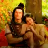
and then arnav khushi siggi they are heart stolen and killer 

i liked your this way a lot though dont know how you blend things so perfectly here but it is just beautiful 

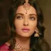
then other fav are of naagin i started watching after seeing your edit πŸ˜†

they are totally fascinating superb ones 
the most i liked it this 

and this is damn cute

sanskar ans swara they are magic 


srk and salman is the perfect blend i loved the blending part the most in that β­οΈ

this is unique and gorgeous 
with below two edit of srk nd kajol and deepika 
stunning they are 

and finally avis aww they are damn cute and lovely 
i liked them a lot 

beautiful update di 
waiting for next eagerly 


this is for you 
thanks a lot for helping me so nicely and with patience


Edited by manyarsh - 8 years ago
FromTheAshes thumbnail
Posted: 8 years ago

Originally posted by: VishaD.


I made yours though but shall update it when i'm done with the rest of the request too.
I can PM you if you want it earlier though πŸ˜›

PM Please,Ab aur intezaar nahi hotaπŸ˜†
I want to see itπŸ˜³πŸ˜ƒ
Amrita thumbnail
Anniversary 14 Thumbnail Group Promotion 8 Thumbnail + 3
Posted: 8 years ago
Visha  All updates are  beautiful,fantastic mind blowing⭐️❀️

Dilwale Stuff is stunningπŸ€—

Minions Avi is cute and adorable


Edited by _Amrita_ - 8 years ago
OtakuGirl-Debo thumbnail
Anniversary 13 Thumbnail Group Promotion 6 Thumbnail + 4
Posted: 8 years ago
Visha love all the stuffs..specially Naagin , Swaragini and Dilwale stuffs..and also that SRK - Salman siiggi is awesome...and DP one is very beautiful..love the Minion Avi too..😳