Originally posted by: Moor278
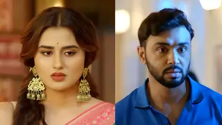
This is a particular shot I had loved when it was shown in the episode..
This was also when the new director came in and I mentioned that this represented the change in treatment.

Elements of visual design
1. Composition - rule of thirds... Sai occupies a third of the total frame... the object you intend to give importance should get a prominent space.
2. Emphasis and movement - At first glance for the viewer, the focus is on V since he is in centre of the frame and in focus while the ladies are blurred ... but he is looking towards Sai.. so automatically a viewer looks at her. Kind off through his eyes
3. Proportion - V - Sai are almost of same height but because he is in background, he looks smaller... which at that point in story he was ...because he was wrong. Pakhi is shorter and has to raise her head to look at Sai whereas Sai is looking down on her. Symbolically it represents Sai is superior
4. Pattern - the fabrics in the back are similar in shade to Sai's saree.. emphasizing her more.
5. Contrast - V is in contrast colour to Sai and standing out which he was then in the story.
And then there is an another interesting element of fire...
The fire is burning near Pakhi as if symbolically she herself is burning which she was in the episode. Her hand is placed such that it feels she is indeed burning physically.
On the outset, it may look like V is an outsider to this equation, but him placed in centre means he is the pivot on which the other two hang... but his focus is only on one side.
So even though, at this point in story, SaiRat are at bad terms... eventually they will come together.
Also, this story is now more of Sai and Virat and not just Virat
Cross refer it to the show title montage where V is in centre but looking ahead while the ladies are looking at him... sort of dependent on him... here he is dependent on Sai.
There are lot of other factors but this is the gist.
Hope this explains what I meant and its not high funda nonsense. 😆


 Kyunki Saas Bhi Kabhi Bahu Thi 2


26