
Bigg Boss 19-Daily Discussion Thread- 30th September, 2025
Bigg Boss 19: Daily Discussion Thread - 1st Oct '25

DADI AS BOOTH 1.10
What's next? (Multiple votes allowed)
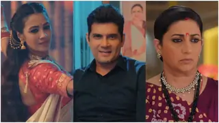
Yeh Rishta Kya Kehlata Hai Oct 1, 2025 Episode Discussion Thread

Swara Bhaskar..someone who dared to say it out loud #respect
Budget Single Digit : 7 cameo openings.
True Face of BIAS & NEPOTISM!

My Box Office Prediction for Sunny Ki....jo bhi hai.

DO NOT REPLY: Current story summarized in 3 pics: ONLY PICS NO REPLIES
Which faces u r fed up of watching

👻 The Manuscript Marauders 👻 BookTalk Reading Challenge October 2025
What are the professional achievements of gabhira
Gen 5- Major Discussion Thread
Official Teaser - Tere Ishk Mein - Dhanush Kriti Sanon
Sonam Kapoor is in her family way ? (2nd baby)
Mihir extra marital affair

The Wanderer Planet
Deepika & Farah Khan; Some Serious Tension !!! 👀

🎉 New Fun Quizzes Are Live on India Forums! 🎉


Beautiful preview always stunning love u
Hattsoff its sooobeautiful thk u so much yr amazing superbbb
Originally posted by: Laugh.Out.Loud
Update on 139.
The update is stunning as always. The icons have a touch of Dangelz but it also has a touch of you. I really love the colouring and the cropping. The kritika ones are my favourite.http://i.imgur.com/v8nsvoT.jpg - The simplicity of this signature is what I love the most. And of course, the black and whitehttp://i.imgur.com/WsU1sRD.jpg - Perfect blending and texture use. If the text was in another blend mode, I would have liked it more.http://i.imgur.com/U6q04Jm.jpg - Nice blending and colouring. The scene seems to be really cute. Kritikas expressions are love.The next black and white sig is so perfectly coloured. I love the way it highlights Kritikas expression.http://i.imgur.com/kSGPpve.jpg - this one definitely is the star of the update. Hotness captured through sig. Word.http://i.imgur.com/1EzegX5.png- I love the blending but not a fan of the colouring. A little more bigness would have made it better. The blue text looks good.http://i.imgur.com/Wr26OjL.jpg - Black and white☺️ the contrast borders and the pic, everything is so nice.Splendid update. And i wrote a larger comment, don't know why LOLUpdate soon <3
Originally posted by: .annihilation.
Hey Ursh!
I didn't realize I missed out on updates from you as I was under the impression that you PM because I remember receiving one long time back. 🤔 Anyhoo, moving on to this update.Reporters stuff is well done. Among the icons, I like the last one the most. Its cropped and colored beautifully and I personally like the picture chosen. Its cute how she steals glances at him every now and then. 😆 By the way, reporters is worth catching up with. Its going pretty well, atleast for now.http://i.imgur.com/kSGPpve.jpg - I liked this style, the way its stacked and colored.http://i.imgur.com/1EzegX5.png - This one's beautifully blended. The BW coloring works well too. However, it should have been a little brighter but its still good nonetheless. The next one looks pretty because of its simplicity.
Originally posted by: ARandKJFan
I AM BACK 😆
Reserved.Unreserving.< I love the coloring in all four but the cropping on this one is totally brilliant. My favorite.https://i.imgur.com/v8nsvoT.jpg- I thought this could be sharper, looks a bit dull to me.https://i.imgur.com/WsU1sRD.jpg- I love what you've done with this, this experiment turned out well. 😃https://i.imgur.com/U6q04Jm.jpg- The coloring and blending is really good, I just feel the font chosen could've been better.https://i.imgur.com/EQltyDD.png- I like this a lot, Kritika's part is very well done. 😆https://i.imgur.com/kSGPpve.jpg- THIS IS GORGEOUS, the coloring is brilliant, the pictures are nice and the font is damn good.https://i.imgur.com/1EzegX5.png- Brilliance, woman. This is blended so very well and I like the font so much as well. :Dhttps://i.imgur.com/Wr26OjL.jpg- The coloring could've been sharper for me, it again looks a bit dull.
Originally posted by: SugarDream
Always adore all your Divyanka or IshRa Edits even when i don't like / follow the Show anymore but i love your Edits on the Show 😳
Originally posted by: ..Steph..
More IshRa stuff please :D <3
I love everything :D <3specially the Reporters Icons ! I love love love the coloring on the icons <3 keep up the good work <3
Originally posted by: Madhura..
Welcome Back Urshie!!! I missed you and you are back fast.
I agree with you abt yhm, can get your point, have faced similar issues, matsh too got a mess, Hindi shows have a shelf life, enjoy Reporters.Hey Madzy! Yeah I am enjoying Reporters for now! 😉
I love the way you cropped, dark colouring and blue glow like Dangzy.
Perfect cropping and colouring, wow!!
Other 2 icons are pretty, but 1st r my fav.
Thanks Madzy! Glad you liked them.
https://i.imgur.com/v8nsvoT.jpg
I like the style, colouring is decent contrast could be more and would be good without texture..or simple black border would be better.
I like the new size, guess std sigs size.Haha yeah Std size I just always made larger size but this works for me right now ! Thanks for the feedback I agree It was hard to colour that one
1st sig is beautiful, great blend and colouring, way you blended textures is fab, fab Urshie. Love the text too..u rock.
2nd signature is wow, bas.
3rd Fab colouring, perfect b/w.Thank you so much Yaar!
https://i.imgur.com/kSGPpve.jpg
Fab picspam, shows your love for him Urshie, great crop, colouring, style. Font is pretty and even textless would have looked great.
Ishra 2nd sig iis perfecto.
1st sig colouring could be much better like 2nd, u are capable of better. Blend is perfect, but col and even fonts could b better!!
Thanks again Madzy! Glad you liked the Picspam and the rest! <3


 Channel V Dil Dosti Dance
 Arjun
Arjun

