


Posted:
Loveliest female,


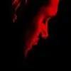
I have quoted my favorite icons from the batch above and you, sweets, have become amazingly good with the cropping and the removing of background. And in these icons, your coloring comes out the best. Although, I must tell you, either over-color or under color your stuff most of the times. Try controlling the brightness and contrast of your colorings? Yeah, anyhoo, these look phenomenal. I have saved the Elizabeth and Hermione ones for use. The cropping of the latter looks pro and classy, you know? Really well done with icons this time, all of them. I like the pink gradient-like background of the ArHi icon too. Texture is used best in the Sherlock icons, but I'm afraid they are mostly under-colored. The House ones, lastly, are all really very well made except for the occasional too dark coloring. Way to go.
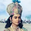
https://i.imgur.com/p53dGpk.jpg looks raw to me, it could have been a great edit on your part. Reduce the brightness and this would look awesomer. Nonetheless, I do like it very much and am saving it. The Sherlock GIFs are really cool, by the way!
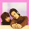
Now then, I like the HP signature the most of this lot, followed by the very polished looking random edits. Very well done, both of them, I cannot criticize them. However, the P&P one's picture is kinds screwed, their heads look funny. But I do know that removing backgrounds from such pictures is an arduous and tedious task, so I think we're good for now. 😳
Great stuff, yeah? I'm gonna post my request shortly, sorry for keeping you wait. And I wrote this comment in a spirit of healthy criticism which may help you improve. Man, I sound high and creepy and professional about Photoshop. 😳 This says something about our lives.
On that note, sincerely,
Me
I have quoted my favorite icons from the batch above and you, sweets, have become amazingly good with the cropping and the removing of background. And in these icons, your coloring comes out the best. Although, I must tell you, either over-color or under color your stuff most of the times. Try controlling the brightness and contrast of your colorings? Yeah, anyhoo, these look phenomenal. I have saved the Elizabeth and Hermione ones for use. The cropping of the latter looks pro and classy, you know? Really well done with icons this time, all of them. I like the pink gradient-like background of the ArHi icon too. Texture is used best in the Sherlock icons, but I'm afraid they are mostly under-colored. The House ones, lastly, are all really very well made except for the occasional too dark coloring. Way to go.
https://i.imgur.com/p53dGpk.jpg looks raw to me, it could have been a great edit on your part. Reduce the brightness and this would look awesomer. Nonetheless, I do like it very much and am saving it. The Sherlock GIFs are really cool, by the way!
Now then, I like the HP signature the most of this lot, followed by the very polished looking random edits. Very well done, both of them, I cannot criticize them. However, the P&P one's picture is kinds screwed, their heads look funny. But I do know that removing backgrounds from such pictures is an arduous and tedious task, so I think we're good for now. 😳
Great stuff, yeah? I'm gonna post my request shortly, sorry for keeping you wait. And I wrote this comment in a spirit of healthy criticism which may help you improve. Man, I sound high and creepy and professional about Photoshop. 😳 This says something about our lives.
On that note, sincerely,
Me


 Bollywood
 Cricket
 Anupamaa
 Kabhi Neem Neem Kabhi Shahad Shahad
 Kyunki Saas Bhi Kabhi Bahu Thi 2

