EditedHello, Enigma. The banner looks rustic and beautiful, okay? The blending you've done is top class. Also, of course, yes, congratulations on your fourth. I didn't your last had ended though. 🤔
Anyhoo, you've been following everything that, in my opinion, is
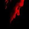
class. 😳 I've saved two of the House icons for use, which by the way, look very cool. Thing is, removing the background hasn't become one of your neater virtues yet but you'll get around. Because it is quite hard, I barely can work it out myself. http://i.imgur.com/i0xOh2Q.jpg is thus, amazingly well made except for the slight misses while removing the image's background!
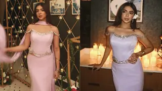
The icons are a bit squashed but very neatly cropped and beautifully colored. I especially like the Queen and KHNH ones, all of them. http://i.imgur.com/9sDgBHZ.png is brilliant, though. And so is http://i.imgur.com/pYLTJEG.jpg - actually this is ultimate.
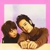
http://i.imgur.com/cWdeUJe.png is beautifully blended. It's simple and very nice.
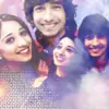
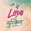
Lastly, http://i.imgur.com/k6ZRh3J.jpg is my favorite thing on the update. Enough said. 😃
See you round!
K Edited by epiphany. - 11 years ago


 Ufff Yeh Love Hai Mushkil

