
Bigg Boss 19: Daily Discussion Thread - 5th Dec, 2025
Bigg Boss 19 - Daily Discussion Topic - 6th Dec 2025

KAVERI IS BACK 5.12
TINGA IS OUT 6.12

🏏South Africa tour of India 2025: India vs SA - 3rd ODI🏏

Dhurandhar has fair opening
Pregnancy ka raaz.
Ranveer and Deepika at an event today
Ambani s Swadeshi Event

CID episode 101 - Episode Discussion
Originally posted by: iluvusakshi
Please, iska font size bada karo..
It's very difficult to read.
Eyes ko bahot strain ho raha hai.

The header still disappears while scrolling down. Comes back scrolling up.
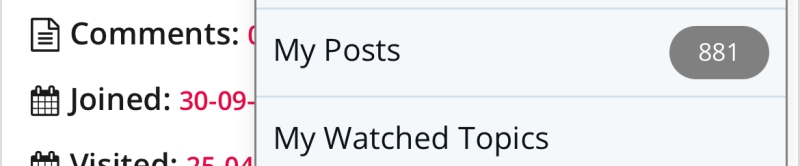
The dropdown in new layout doesn’t have some outline around posts number to differentiate
The new one also has more grey gradient like the quote box which you improved. If you could give a look at this as well
New
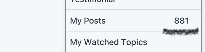
Old - which I can access from my profile page
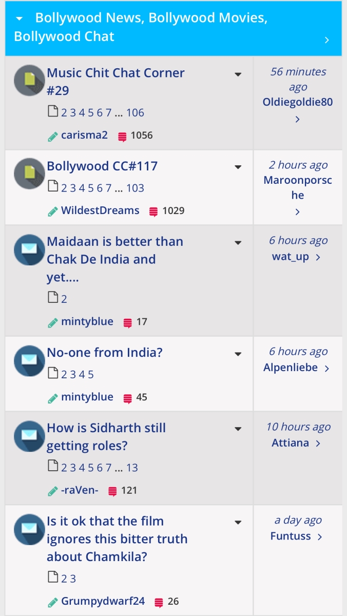
I will try and make this request once more. The old layout for main page posts was easy on the eyes. maybe because it was elongated, had more white space, different colour scheme. The new one feels so cramped and tiny I cannot read the titles on the main page without feeling strained. The green pencil also overlapping with usernames. If there could even be a minor improvement it will be great
Old
New
We have updated the page. Please check now.
The Forum Guidelines width has been reduced.
ah yes it looks much better, thank you!!


Hi All, First off, a huge thank you to each one of you! Your active participation and enthusiasm continue to shape our community into a vibrant...


 Channel V Dil Dosti Dance
 Sports
 Anupamaa
 Kyunki Saas Bhi Kabhi Bahu Thi 2


1.5k