Originally posted by: Basskarrr
Sincere request to take this at the bottom of the page. I gave a break of a day from the forum and my eyes still can’t adjust. Better remove the “numbers” and just keep the share tab at the bottom of the page
Aah this thing got fixed
It didn't move to the bottom but atleast the top
Things are slowly coming in order. Thanks to the team for their hardwork
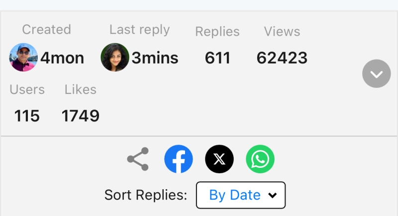
Fixes and Suggestions :
The size of the content boxes should be proportionate to the content
The expand UX , it's a good feature trust me but I can't seem to get past that expand pill and gradient there's too much happening there. Can we have something more minimalistic like clicking on the box makes it to expand or collapse
We've made good progress with the font sizes and weights just a little bit more tweaking and it should be perfect
The color pallette with the post settings here or the notification menu etc it's all hues of grey . Tbh grey to me gives a feel as if it's disabled so this grey on grey color palette makes me feel like the page is frozen
PS: I'm not expecting the changes to come into effect today but it would be great if you could give these some thought


 Seher Hone Ko Hai
 Kyunki Saas Bhi Kabhi Bahu Thi 2
 Cricket


1.5k