
Bigg Boss 19: Daily Discussion Thread- 13th Oct 2025
Bigg Boss 19- Daily Discussion Thread - 14th Oct 2025

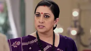
Mannat Har Khushi Paane Ki: Episode Discussion Thread - 30

COURSE STARTED 😛13. 10
Yeh Rishta Kya Kehlata Hai - 13 Oct 2025 EDT
ASTHIN KA SAANP 14.10
Yeh Rishta Kya Kehlata Hai Oct. 14, 2025 Episode Discussion Thread

Alia Bhatt Creates History

A Historic Moment: Israel- Gaza Peace The October 2025 Ceasefire
Child Contestant Behaviour In KBC
Kajal,Vidya and Tanya ka Gharelu Kalesh
Like/Dislike/Neutral Week 7
Rhea Chakraborty and her brother get their passports back

Ishq Ki Taqdeer ~ A SOTY FF


We’ve given the Member Profile Page a fresh new look! ✨ You’ll now see a sleek redesigned layout that puts the spotlight on you — with the...


 Bindi
Bindi
 Udne Ki Aasha
 Kyunki Saas Bhi Kabhi Bahu Thi 2


36