*VOTE: GKLB Banner Voting - CLOSED!*

CarulinaTina thumbnail
19th Anniversary Thumbnail Stunner Thumbnail + 6
Posted: 17 years ago
#1

(glitter name by Tumhari_Khushi)

Namaste doston!! 🤗

Time for round 2 of our banner voting! Thanks everyone who voted in the last round! :D

How to vote:

Below you'll see the top 7 banner entries that have made it to round 2. Each of it has a number. Please choose your favorite and post its number.

Everyone MUST vote for only 1 banner!

You cannot vote for your own entry.

Dont create multiple ID's to vote for your banner, or else your entry will be disqualified.

Vote very carefully! We want our forum to look beautiful, so choose the banner you think will look the best up on the forum!

Things to consider while voting:

The main characters of the show are all portrayed in the banner

The show's name is spelt correctly

How clear the banner is and if you can read the title of the show clearly

How well the banner pictures are merged so that there is a free flow in the banner

How creative the banner is, the effects and the different coloring of the banner

Creates the essence of the show well and when you look at the banner you know it represents the show

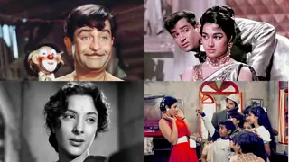
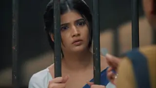
And finally... these are our top 7 entries:

Entry No. 1

Entry No. 2

Entry No.3

Entry No.4

Entry No.5

Entry No.6

Entry No.7

This post is image heavy, so if any banners aren't showing up, then try refreshing th
e page or contact one of the Dev Team members.

The last date for this round of voting is February 17th, 2008! So vote quickly! =)

Loads of Love,

Priya and Kruthi
Betiyaan Development Team
Edited by *Kruthi* - 17 years ago

Created

Last reply

Replies

22

Views

2.7k

Users

23

Likes

2

Frequent Posters

HobbitButt thumbnail
19th Anniversary Thumbnail Rocker Thumbnail + 2
Posted: 17 years ago
#2
#1

Good Luck Everyone! 👍🏼
eternal thumbnail
18th Anniversary Thumbnail Rocker Thumbnail + 2
Posted: 17 years ago
#3
ummm its between 1 and 7 for me....

i think i'll go with #1

great job everyone...
gp00 thumbnail
17th Anniversary Thumbnail Dazzler Thumbnail Engager Level 1 Thumbnail
Posted: 17 years ago
#4
#1 - They've got to fix the font style and color on this. It's almost invisible. But the flow of situations looked good. Others looked good, but they were individual shots pasted together and not saying anything.
Piku_S thumbnail
20th Anniversary Thumbnail Stunner Thumbnail + 7
Posted: 17 years ago
#5
#1
goodluck everyone 👏 👏 👏
209252 thumbnail
Posted: 17 years ago
#6
This was a tough one but my vote goes to #1
Bee3nazz thumbnail
17th Anniversary Thumbnail Dazzler Thumbnail Commentator Level 1 Thumbnail
Posted: 17 years ago
#7
#4 i really like the way it stands out yet the piks mix into each other n the fonts good 2!
alydesi_chick thumbnail
Explorer Thumbnail
Posted: 17 years ago
#8
😃 #1 is winning but I go with #7 😃
imprincess333 thumbnail
17th Anniversary Thumbnail Navigator Thumbnail
Posted: 17 years ago
#9
They're all great! But I vote for errrrrrr....#1

👍🏼 Esha
237966 thumbnail
Posted: 17 years ago
#10
All are good.

I will go for entry no#5, because it is very clear and even Dev is included. Some of them there is no Dev included.

Related Topics

Top

Stay Connected with IndiaForums!

Be the first to know about the latest news, updates, and exclusive content.

Add to Home Screen!

Install this web app on your iPhone for the best experience. It's easy, just tap and then "Add to Home Screen".