


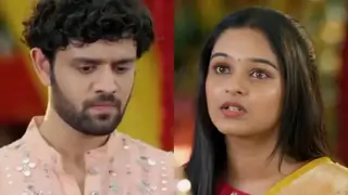
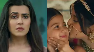
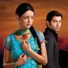
Posted:
The designer for the Rangrasiya promos has a very artistic eye ... all three are in very stark monochromatic colors ... Paro in red, Rudra in military green, against a golden yellow harsh backdrop ... visually made a huge impact.Only the third one had more colors with the wedding party brought in.
Yes the sands were harsh and golden , the military green was official looking and a dull green and the shade of red Paro wore was so vibrant - I think they very much go with the symbolism in the show (which I got from the first two promos)
The third promo was action packed and more of a story-telling promo so no need for as many symbolisms and of course colourful with it being a wedding party
very impressed with the designer!


 URL link - https://i.imgur.com/vt6WBhR.jpg
 URL link - https://i.imgur.com/DIqm1J6.jpg
 URL link- https://i.imgur.com/rkqPjH8.jpg
 https://i.imgur.com/dBjL6YO.jpg
 https://i.imgur.com/DwcjD7U.jpg
  https://i.imgur.com/dMsVvb2.jpg


 Udne Ki Aasha
 Jaane Anjaane Hum Mile
 Fan Fictions
 Kyunki Saas Bhi Kabhi Bahu Thi 2
 Iss Pyaar Ko Kya Naam Doon

