


Posted:
Originally posted by: Shutter_Island
Ohk keeping aside the raunchy stuff 😆 In my perception it's a pretty eye catching & innovative poster...1stly the pose is just not for the heck of it, but forming '2' of ABCD 2 + it also depicts an arc, a journey from Nana supara to Las Vegas (in the poster via slums to lavish RcC Vegas building)...Its better then what I expected... I thought it would be those cliche kathwheels and high jumps...they should have gone easy with the photoshop though + I wished that Varun's MJ tattoo was incorporated!!
It looks good on second viewing minus the Photoshop. Would have been even better if they had avoided that.
And its not that they are doing the pose for the heck of it. Like you said, they are trying to make the 2 from the title . Even without the 2, looks like a snap of a dance turn or something. The way Shraddha's fingers are pointed indicates to that.


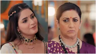


 Kyunki Saas Bhi Kabhi Bahu Thi 2
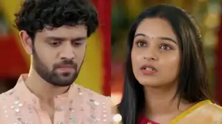
 Iss Pyaar Ko Kya Naam Doon


6