
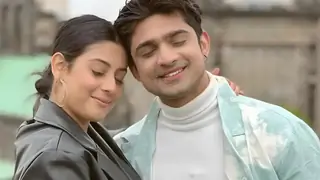
Yeh Rishta Kya Kehlata Hai - 31st July 2025 EDT
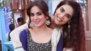
MERI MUMMA GEETU 31.7
TRIALS OF BOND 30.7

Param Sundari song Pardesiya out now
Emotional support 😢 animal 😍😍🥰🥰🥰 silly boy ☺️☺️☺️
Paravarish

🏏India tour of England 2025: 5th Test: Eng vs India- Oval, London🏏
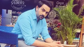
New Time Slot
Kumkum Bhagya New Season | Episode Discussions Thread #5
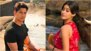
After so long we see Katrina with Vicky

Anupamaa 31 July 2025 Written Update & Daily Discussions Thread
Chhaava continues to remain the biggest HIT of 2025
Dhadak 2 - Reviews And Box Office
War 2 Run Time 3h 5m
National Awards For Vikrant Massey Rani Mukerji

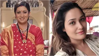
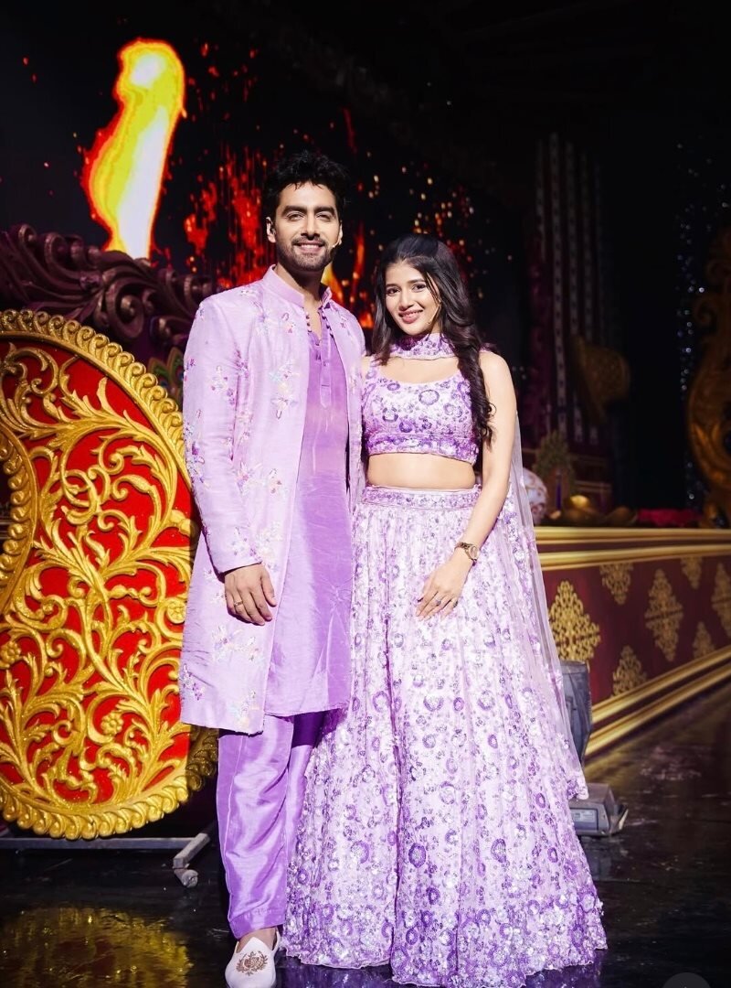
Jodi name for Mihir-Tulsi
Rohan Khan Wiki, Age, Height, Biography, Family
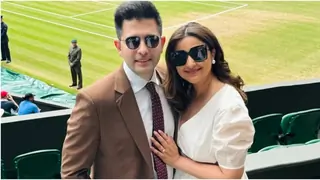
Katrina Kaif Pregnancy Rumours
AR Murugadoss Blames Language Barrier For Sikandar Failure

📚 The Bookish Personalities 📚 Book Buddies Reading Challenge
Originally posted by: RatiTheAngel.
http://i.imgur.com/kUfGo49.png---amazing blending
http://i.imgur.com/zVhuxtx.png--amazing style and love the coloringhttp://i.imgur.com/SoIiVJm.png---AMAZING textureeehttp://i.imgur.com/LR3Kr8M.png--love this texture fab its looking prettyhttp://i.imgur.com/z9F7lS0.png--amazing blending in neira siggy and this scene is wowwwhttp://i.imgur.com/UefnCsg.png---this promo of neira is fab fab and ur sigy on this proo is magical loved itrest all other stuffJAAIRLINES50SOGBIRTHDAY AND REQUEST WERE FABAMAZING UPDATE VISHA👏AND MANY MANY CONGRATZZZ 🥳FOR BECOMING MODERATOR I KNOW ME LATE SORRY FOR THAT KEEP CLAIMING L IKE THISONLY 30 PAGES LEFT FOR COMPLETING THIS SHOP😊
Originally posted by: Radhikerani
Loved The Whole Update !! These Two Were The Best !
http://i.imgur.com/LR3Kr8M.png
http://i.imgur.com/VtXRtYN.png
Gorgeous Update!! IKNMP ones r totally amazing!!!
Originally posted by: Sehr_VruShan
awesome Update Dear👏
Loved all the stuff specially MaNan "Kiss of Love" Siggy 😳
Keep up the good work
Originally posted by: .LilGreenRobot.
*sigh*
I was away for sometime 😳-----Congratulations!! Moderator now 😎I noticed that the purple matches your main gallery banner 🤣Thank you so much and yeah, it actually matches my gallery's theme 😆Anyway.. I'm just gonna move along and comment on the update-----Firstly; I have to mention my favorite from this whole update which is:http://i.imgur.com/zVhuxtx.png - I love this new style you've used. The way you placed the pictures is perfect. Really love the zoomed in pictures at the top and bottom to show their emotions then the middle bit which obviously is a little bit further from the other two. The blank spaces on this make the sig stand out even more. I love love love the blue/purple used. And finally the text. Outstanding! Showstopper in my opinion for this update. You should make more with this style 😛Thank you so much. I tried making it in my normal size but i felt the emotions here was important, hence given their own space 😆http://i.imgur.com/kUfGo49.png - Absolutely gorgeous. I think I missed this episode 🤔 .. I don't remember seeing this 😆 .. Before I lose track of what I was gonna say; one thing that caught my eye here is the sizing of the text at first. You used a few lines and still managed to make the text look great and not crowded at all. That's very commendable. And the second thing that made this sig very attractive is the way you've balanced out the coloring with the light and dark bits.This was personally one of my favorite one and turned out better than i expected 😆http://i.imgur.com/SoIiVJm.png - This is overly adorable! He looks so innocent there holding his ears. Honestly; there isn't much to say about this. The text speaks for itself. I just can't get over his cute expressions. You've chosen perfect pictures for this and the text compliments it. The effect used on the text is superb too. Again; played with the texture very cleverly. Not very much visible but it still accolades beautifully.This was a cute scene and he was drunk here. Hence all the cute expressions 😆http://i.imgur.com/LR3Kr8M.png - Simply stunning! Texture is absolutely topnotch too. Really really really love the simplicity of this to be honest. Un-fussy and perfectly laid out. I don't know if it's just me but I see some sort of smokey texture thingy in the top right corner. Sort of black'brown smokey. [Just ignore my ramblings in between]. You've utilized two pictures greatly. I love the blending here too. I always find it hard to blend white with some other color; it never turns out right. You've blended the top and the bottom pictures effortlessly. It's perfect and unblemished.Yes, its indeed a smoky kinda texture. I used to have that problem and tried out different textures that would match it.http://i.imgur.com/UefnCsg.png - Three cheers for you! I'll tell you why. Everyone who made a sig on them from this promo chose the dark coloring and everyone made the red stand out; including the use of red font. I did this too. But you went the opposite direction. This looks stunning! The green/blue coloring goes very well. It's soft on the pictures too. And I like how you've also included their pictures in reality not just the beautiful past of theirs. Really love the straining of the background color to make the lighter pictures stand out.Yeah, i wanted the blue and green to stand out here and i'm glad it did 😆I don't watch the show but i feel that this promo was a MUST make creation scene 😊http://i.imgur.com/z9F7lS0.png - The text here is so beautiful! Honestly. This was a beautiful scene and you've done it justice. The greenish/bluish coloring looks fantastic on this and the blank space on the top left corner gives the sig a sort of lonely effect in my opinion.That sentence came instantly when i made the creation and it suits the scene very well 😊http://i.imgur.com/VtXRtYN.png - This is so painfully beautiful if you understand what I mean. The text you've used is utterly gorgeous! I love the texture you've used. I don't know; it looks like some shiny galaxy thingy. I can't even make out what it is but it goes very well with this sig. Sizing of the pictures you've used is perfection. Great choice of pictures to depict their emotions in this. Totally exceptional.You got the texture right 😆http://i.imgur.com/4V3lZDe.png - The only sig in this update with no blue 😆 .. Looks wonderful. I love how you can either use very little or quite a few pictures and you manage to make the sigs look perfect and not crowded or empty at all. I don't watch this show anymore and I'm shocked that he said I love you 😆 .. As usual I always love the smudgy/highlight thing behind the text.So you found out about my obsession with blue 😆This was a good show and i'm sad it ended. And that too, this was their last scene together and show ends 😭http://i.imgur.com/xTZ7oiJ.png - Finally! The most awaited movie ever!! Got my tickets booked already ☺️ This doesn't even need justifying honestly. The text there and the pictures show everything ☺️ .. But I really love the texture you've used. Grayish/gravelly. Looks superb and also compliments the coloring and font color you've used 😃This movie is banned in Malaysia as its considered as a po*n movie here 😕http://i.imgur.com/GvTQkUF.png - Salman looks adorable! Love the use of b&w coloring as well. The blue splash looks gorgeous! Really caught my eye 😃Thank you so much 😃http://i.imgur.com/ysgXMNt.png - The request is outstanding! The 3-D looking text is first class. The cloudy texture at the bottom is magnificent.Keep up the marvelous work Visha 🤗Love,Annie xP.S - Sorry for the extremely late comment. Didn't even get to RES this timeOn the brighter side; this gallery is nearly done 😃


HOLLA EVERYONE ! Your very own Sydell is back and am here to share with you some edits that I have made in the past years when you guys missed...


 Hindi TV Shows
 Bigg Boss 19


72