The Science of Shades#1. // H.i.a.t.u.s - Page 24

Created

Last reply

Replies

441

Views

36.6k

Users

84

Likes

818

Frequent Posters

abditory. thumbnail
13th Anniversary Thumbnail Stunner Thumbnail + 2
Posted: 10 years ago
update 4
These days i m experiencing an infinite sense of freedom and blissfulness. The reason being for it is less assignments and some unnecessary holidays. The updates will be more frequent and smaller now. And i m not in a mood to talk today hence this dry hello. ☺️

Sonam Kapoor.


Kal Ho Na Ho.


Grey's Anatomy.


Sadda Haq.


Sherlock.


Zindagi Gulzar Hai.


. . . . . .
Goodbye for now people.
Edited by exhalelove. - 10 years ago
26javey thumbnail
17th Anniversary Thumbnail Sparkler Thumbnail + 3
Posted: 10 years ago
Reserved

edited

There's no Olicity in this update :( Oh well...As usual amazing update. I LOVE the SK sig. It's so elegant. The colouring is perfect. The KHNK one is phenomenal. I adore the style, your use of texture and colouring is genius. The GA picspam is perfect, those were some hard GA days. Great work on it. I ADORE the SH picspam. The colouring and use of pictures is perfect. The Sherlock one is sheer perfection. I love the style. I adore the ZGH icons. The colouring and cropping is to the point. These ones stand out the most,


AND I'M FIRST

I really do want some Olicity stuff for my dhabba.
Edited by 26javey - 10 years ago
Flame.Of.Rose thumbnail
15th Anniversary Thumbnail Sparkler Thumbnail + 3
Posted: 10 years ago
Reserve.
I'll unreserve of this update now. Older ones will take time. :)


Unreserve.

Damn! Why second and not first -.-


Okay, I am not saying much as you already know that I have always liked your colourings and also I was there when you just started PSing while in QH forum. I can definitely point out a LONG way from then.

Okay, so small but frequent updates. Means, I have to comment more. Woman you'll be death of me. -.-

Chalo koi nae, if you keep on giving me awesome updates, I won't mind. 🤣 🤗


Now the update.

http://i.imgur.com/0rjo8El.png - I am not that of a admirer of Sonam Kapoor but the first part of siggie made her look so innocent and gorgeous. I absolutely loved the colouring and the light grainy texture you gave to it. Overall it was a nice siggie and the textures used were all good.

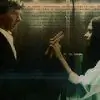
http://i.imgur.com/OK0yPnX.png - Okay first thing first. Those Lines. THOSE FREAKING LINES ARE MY FAVOURITE FROM THE WHOLE SONG Every thing aside, I love you woman just for those lines ❤️ Now the sig. I love LOVE the texture you used for this one. It fits so perfectly with the flow and then the shades of blue, of sadness just act as a cherry on top of a lava cake. The earth shade went on with contrast to that of blue and I died right there in the last part of sig. Gosh the way in which the pain is captured and highlighted. Did I ever told you how much I love you?

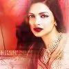
http://i.imgur.com/979f4Ii.png - Since I haven't seen the show yet so can;t say anything about choice of pic of emotions and stuff but yeah I absolutely adored the colouring over there.

http://i.imgur.com/gnyp4Vk.png - Ah! This show. No, I stopped watching. Its only KY2 for me now 😆 But yeah I know it enough to say that you have taken some of the most memorable scenes of their romantic journey. And the use of warm and earth colours just make them look even more expressive and symbolic.

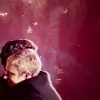
http://i.imgur.com/LmrST8T.png - To hell with everything and anything. I am dead. Bas. SHERLOCK MY LOVE! Eeepppsss. Mai toh bas usko dekhkar hi fida ho gae ❤️ Those pictures were like bang on. He is in his thinking mode, thinking and solving yet another mystery of this world. The textures toh don't even ask. I liked the one in third part, love the one in second part and died seeing the first part. I am already in heaven and commenting from there.

Acha I also want you to make something on Robert J. Downey (Sherlock - movie)


http://i.imgur.com/3U2Dqt1.png
http://i.imgur.com/K7yarqI.png
http://i.imgur.com/OGXCYeB.png
http://i.imgur.com/rS2ia8i.png

The whole set is so good but I liked these four the most. The reason being well, the first two one my one of the most favourite scene of them together, other being that under the moonlight one. And the individual icons were like standing apart. I liked all the colouring game you did here. As you already know that I am goner for colouring so yeah, you have my vote there 😆


All in short, the update was good, something I'd expect from you always. Surprise element for me was that I never saw your works of that other than KaJen so yeah, many of the things were pleasantly surprising for me 😆

Filhaal make that Sherlock siggie I requested up there and baaki ka I'll tell when I feel like it.

Just keep going uphill girl 🤗

- Aditi
Edited by Flame.Of.Rose - 10 years ago
-MitwaIshqPe- thumbnail
12th Anniversary Thumbnail Stunner Thumbnail + 3
Posted: 10 years ago
Stunning Update Salwa 👏👏
https://i.imgur.com/0rjo8El.png

^^ The different coloring is gorgeous.. love the use of texture

https://i.imgur.com/OK0yPnX.png

^^ Love this set.. again brilliant use of texture 😳

https://i.imgur.com/LmrST8T.png

^^ Amazing job on the blending 👏


^^ The ZGH icons are mindblowing.. these 3 are sensational!

Nisbah 🤗
Edited by -MitwaIshqPe- - 10 years ago
.LilGreenRobot. thumbnail
13th Anniversary Thumbnail Sparkler Thumbnail + 5
Posted: 10 years ago
Res.

This time I'll definitely unreserve because I have a free week 😆


------------
Hi.


No KaJen in this update .. Looks like I'm gonna have to wait longer to change my dabba.. The one I have now has been there since forever 😆

Anyway...

http://i.imgur.com/0rjo8El.png - Not a huge Sonam fan but the sig is gorgeous. I like the variation of colors used. She looks so innocent in the first and last pictures 😳 .. The texture on the first bit is amazing

http://i.imgur.com/OK0yPnX.png - This is painfully beautiful; if you understand what I mean 😳 .. The texture here is phenomenal. I love the touch of blue and grey to it; totally fitting to the mood of the whole sig. Those words; like OMG .. The last bit. My favorite scene from the movie. The scene was perfect and you've done it justice. I don't know what it is but, the two blank boxes you've left seem to signify emptiness and loneliness to me tbh 🤔 .. overall; the whole thing is exceptional.

http://i.imgur.com/979f4Ii.png - THIS show is downright bloody amazing! And this episode, I was literally at a loss for words and astounded. The coloring on this is striking and obviously tiptop The font, text, and where you've placed it is perfection. But the last strip. What can I say? Sheer brilliance, maybe.

http://i.imgur.com/gnyp4Vk.png - Never watched this show but the sig. *sigh* it's simplicity is what makes it flawless. The colors here are splendid 😳 not too bright and not too dull; just the perfect balance. Having no text on it wasn't a very bad idea. It looks great.

http://i.imgur.com/LmrST8T.png - Sherlock! The pictures sheer magnificence. The texture used is marvelous. Makes him look much more focused.

You've seriously perfected the art of making icons 😳

http://i.imgur.com/OGXCYeB.png
http://i.imgur.com/3U2Dqt1.png
http://i.imgur.com/Ox3P0Oz.png
http://i.imgur.com/K7yarqI.png

I had a tough time picking out my favorites since they're all spectacular. Cropping as usual, done to perfection. Coloring is fabulous. Very attractive and eye catching.


------------


Bye.
Edited by .LilGreenRobot. - 10 years ago
amidstthehues thumbnail
11th Anniversary Thumbnail Navigator Thumbnail Engager Level 1 Thumbnail
Posted: 10 years ago
Edited.

--

I like how you keep your icons simple. Making amazing stuff sans extra grand overlays; you've indeed polished your skills a lot. Like all the icons from ZGH set.

http://i.imgur.com/gnyp4Vk.png - I like how you brought out the details and highlighted theme without text usage. Like how cleanly you've faded the actual backgrounds from individual ones, keeping what's needed to maintain focus intact.

I particularly like the coloring of Sonam's last panel. Also that extra border you've made out of it.
That one is aptly sharpened and cropped. Good job, really.

http://i.imgur.com/LmrST8T.png I find the first third pretty appreciable, and best among all 3. Even though second one is darkened over third and looks odd to me, the piece overall with all 3 parts looks well made. Lovely colors and simple techniques.


Ciao.


Edited by amidstthehues - 10 years ago
minakrish thumbnail
Posted: 10 years ago
Sheer stunning creations Salwaaa!
SK one is beautiful and aah.. my favourite ZGH!

Stack stack stack! 😳

Edited by -Mrinalini- - 10 years ago
minakrish thumbnail
Posted: 10 years ago

P.S.: Me is using this! 😳
abditory. thumbnail
13th Anniversary Thumbnail Stunner Thumbnail + 2
Posted: 10 years ago

Originally posted by: -Mrinalini-

Sheer stunning creations Salwaaa!

SK one is beautiful and aah.. my favourite ZGH!

Stack stack stack! 😳

Here you go

hosanna.. thumbnail
13th Anniversary Thumbnail Stunner Thumbnail Networker 1 Thumbnail
Posted: 10 years ago
Really great update! I love the KHNH one.

Related Topics

Top

Stay Connected with IndiaForums!

Be the first to know about the latest news, updates, and exclusive content.

Add to Home Screen!

Install this web app on your iPhone for the best experience. It's easy, just tap and then "Add to Home Screen".