THAT ARMAAN SIG SHOULD HAVE BEEN CUSTOM MADE FOR ME. :( Edited :
You know I am pretty okay with whatever way you decide to update. Just be awesome, that's it.
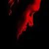
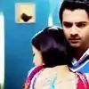
I'll just have to quote the entire batch of icons. 😳 They couldn't have gotten better, word. From the cropping to the coloring to the texture, its all so perfect. Especially the Khirad one, especially. 😳
http://i.imgur.com/RpmWRIl.png - GOODLORD. THE BLENDING. There are a million other ways to blend but you had to blend this way. Why? Because you're awesome! (Imagine I said that in Dean's voice) Its both technically and visually perfect. <3
http://i.imgur.com/1k2Czg8.png - This one's quite innovative, I love the idea. The way you did the text kinda reminds me organic chemistry diagrams but like they terrified me, this doesn't. 😆 The picture's cleaned quite neatly and the purple-ish coloring looks beauiful.
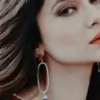
http://i.imgur.com/LUlJoBx.png - THIS. Just so that you know, I hate how this one's not exclusively for me. How could it not be for me. ): h o w. That aside, this is so much brilliance. The right pictures, the perfect cropping, the correct focus, the apt texture, the impressive coloring and the slight 3D effect ; genius.
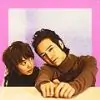
http://i.imgur.com/BOwZOEz.png - I quite like this too! I like how it has the right amount of brightness. The best thing about it would obviously be the text.
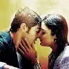
http://i.imgur.com/muC5Ep6.png - Impressive blend, again and I like that box-ed sorta texture. Using that hand picture works very well, concept-wise.
http://i.imgur.com/LdjbPMg.png - There's no one who can use blue as beautifully and sophisticatedly as you do. Also, it looks so brilliant with its silhouette effect.
Okay, bye! 🤗
Edited by herms_angel - 11 years ago


 Kyunki Saas Bhi Kabhi Bahu Thi 2
 Book Talk

