Originally posted by: ChunniBabu
-Edited
Cutlass Creations, I never really knew you had a gallery Ash. I updated after months na, Mai khud bhul gayi thi. 🤣This is my first comment on your gallery so first of all, congrats to you both and wish you many more shops in future 🤗 TY !! :D
Now coming to the update.
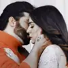
Rishbala stuff
http://i.imgur.com/hUs8ZUB.jpg
http://i.imgur.com/sYOO06B.jpg
I love how the colours have been merged in this. Nothing looks odd or over, all the shades look well balanced. These two were my fav from the entire rishbala stuff in terms of colouring, texture, blending..everything. Thanks! <3
And this one as well, http://i.imgur.com/RqAriV6.jpg I really like the over all sig., the outcome basically.
Really love the bright effect you used in here http://i.imgur.com/bTO7o7t.jpg
Rest of the Rishbala stuff, I hope you won't mind honest feedback, I felt could have been better in terms of both, curves and levels. And that's just my opinion!!
I like criticism, It helps a person in improving. 😳 And the flaws you mentioned, I guess I already knew about them. 😆 thats why took care not to repeat them again. 😳 thanks for telling me my flaws BTW. 🤗
Abhiya
Like both the sigs.
Sharpness of first goes well with its saturation n luminance
And the de-saturated effect in second looks nice as well.
U know PS too well girl. 😆 No matter your siggies are beyond beautiful. 😳
Kajen
Damn.. LOVE this style of yours http://i.imgur.com/3f95nU3.jpg
Varun's sig, I appreciate the style and I even like the over-saturation in it :D
Thanks !! :D
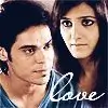
Now coming to SwaRon update,
http://i.imgur.com/UrVaSmM.jpg
Its brightness doesn't go well with the saturation and is giving a burning effect.
This one I had made really randomly and to hide something, i had to do everything OVER !! Had no intensions of posting it in here coz it had come out crap. 🥱 But thought ki koi edit kyun chupau? so what it came out crap? 🤣
http://i.imgur.com/7IjOQvC.jpg
WOW! this is something diff. the text style n use of colours.. I LOVE this sig ^_^ Seriously!
I, though feel it could have been better but what I have noticed is that everyone loves this sig. 😆
and http://i.imgur.com/odY1En2.jpg this tilted border style of yours, I like this as well (here and in kajen sig :D)
Thankuu! :D
ArSha
Again, this style --> http://i.imgur.com/dOQWWVW.jpg <3 :D
This is my personal fav! ^_^
http://i.imgur.com/s1sfS1s.jpg
http://i.imgur.com/ivNlMSb.jpg
They are really nice ones! Dark hues are well balanced in first n second one looks vividly sharp. Thanks !! :)
http://i.imgur.com/mSNPkLU.jpg This is again something different, I like it.
http://i.imgur.com/a5gJpvk.jpg
http://i.imgur.com/gIfhVcF.jpg
http://i.imgur.com/eAW2FJq.jpg
http://i.imgur.com/eAW2FJq.jpg
I am in love with your styles, so versatile of you to try out so many things. Every sig is unique in its own way.
I am a newbie to say the truth. So I like experimenting which also includes trying new styles in every sig I make. Thats what Madz had aviced me and it actually works for me. Experimenting helps me improve and so, i jus love to put different styles in every sig !! 😳
VD sigs
http://i.imgur.com/z1eSDl9.jpg
Again, I love the style but I feel text would have looked better if bold.
Guess what? the text is already bold. 🤣
http://i.imgur.com/LUnJBJ7.jpg
http://i.imgur.com/awIAHza.jpg
These are my fav and I really like the one you said is not very good 😆
Choice n placement of pics is really nice in RK hybrid. I always work more than hard for VD sigs. 😆😆
http://i.imgur.com/5X0rp1X.jpg
I love this and it's mainly coz of that third lil eye clone at the top, towards left. So like I've been saying throughout the update.. YOUR STYLE!! Me is fan of your versatility and I can see some very very fine signatures, in terms of style, coming from you guys in the future updates. So dare you forget to pm me 😆
Fan? Haila ! Now that is something BIG !! I have a fan !! 🤣 Wanna become a perfectionist in future and I need to work really hard at this stage, so doing that.. Just doing experiments irrespective of results and glad u appreciate them. 😳
Coming to the icons
MY FAV ONES <3
http://i.imgur.com/dG4skDc.jpg
http://i.imgur.com/lKZjda0.jpg
http://i.imgur.com/96WcEJH.jpg
http://i.imgur.com/VbUcj66.jpg
I love their size, cropping you did and how you maintained the pic quality though I found rishbala icons a bit blurred. Did I make any icon on RishBala? 😕 I guess you mean DVD. If Yes, then I agree. 😆
I like how you've cropped this one
http://i.imgur.com/OvVDMoT.jpg
http://i.imgur.com/LXnDb5R.jpg This I like but face looks thinned. Yeah. U r right.. Will take care next tie about it. 😳
http://i.imgur.com/drGNVlq.jpg
<3 I love its colouring.
And it's such a cute icon 😳 My favvv !! :D ^^
Now coming to the next part..
http://i3.minus.com/ibz1f80ZmZVBFT.jpg
I love its curves and levels. Such a pretty colouring <3
And the texture as well!!
Even the desaturated swaron sig looks nice.
http://i1.minus.com/ivdbQONYSuBPC.jpg
A very unique sig. in terms of style. Love it <3
http://i5.minus.com/ib1KILptPCTQr3.jpg
http://i3.minus.com/ibwriQNa50HdYG.jpg
Love these sigs <3 Esp. the outcome of tanu's sig
http://i6.minus.com/ioj3vBHUpmBzN.png
really like this dark colouring Kriti, it suits the edit <3
And icons are good. Like them all
http://i.imgur.com/Tq9uO4a.jpg this is just bit blurred
AND REQUESTS!! Shakti ones are lovely and this
is amazing http://i.minus.com/iqnoBzUbMe9ib.jpg <3
A BIG BIG Thankuu on Kriti's behalf !! 🤗
Lovely update girls!!
Keep trying new styles and thanks for the PM. Thankuu and Pleasure !! 😆
Hope the comment was long enough 😃
It was too long !! I like it. 😎
-ChunniBabu, baatli vala(i) 😎


77