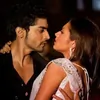
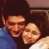
So I am on a spree to use different colours these days. It's so much fun! 😆 @NaughtyRa - Try, try, till you succeed, my friend. Well, ain't I too good at this philosophical trash? 🤣 I love the 'brother for life concept'. Such an innocent effort, again. I love how you bring up such creations! And most of all, the choice of pictures is exceptionally good. 😳 Okay and then another one? the crying scene. Idk why most of you weren't satisfied with it. For me, Kiya looked amazing while crying. 🤣 And, KD was so good to her. I love how he held her hand. It was one cute scene. I must surely thank you for working on it. And believe me, it's just the start you'll soon be good at it. Perfectionists are born only after they try and show the world their efforts!
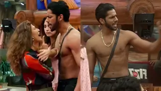
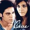
@krazy4KD - Aww.. It's so awesome to see you work, always. 😳 The blends are so goood. And then so many pictures combined into one? Can I ever have any words for it? I suppose, no. All I know is, I totally adore the creation by you. It's basically summarising how hot our KD is. 😆 OMG, how can I resist myself from staring at it? Seems like your boringness became a treat to me. 🤣
@joshyalbinaAlBz - I don't why, but these days I find Kiya even prettier. It's like I'm loving how her make-up artists are experimenting with her outfits and hairstyles. She has always been a girl personifying fashion. And the three pictures you've chosen, portray three different phases, about how stylish can she be. The body cuts are done perfectly. Colouring is gorgeous. Moreover, this creation is like a package. ❤️
@Mais - Can I please be frank about not liking Rukmini? 😭 Panchi used to be so good with Ranvir. I miss them together. It's rude how Ranvir is kinda ignoring Panchi. Welll, anyway, beautifully conceptualised creations. Talking on technical terms, http://i.minus.com/imKe2Y6KsrJaH.jpg I am in love with the bloominess or softness or whatever they call it, the beautiful bokeh makes it speak volumes. Heavenly creation, Maisy. Specifically the blending of these two pictures. There is a very thin line between it being one single picture and it being two different pictures, and that thin line, is like negligible. The glowing text makes it just the best. http://i.minus.com/ibw7SON2isAcmI.jpg I love this more, undoubtedly. The font used for 'not yet' looks so royal. And the complete blurriness gives it the chocolaty look. http://i.minus.com/iBuMoB9lzQAaH.jpg The shaky effect is brilliant. Love the font combination for the text, simple, beautiful and soothing. The switches of colour tones from one to the other is fantastic! Well, here in this update, lies the reason, for you being my favourite. You're one talented creation-maker. Superb creations. ☺️
@Ash.TanHa21 - OHMERAGOD! Such a beautiful creation. The text stands out from everything. Great work with the blending of the snaps. And their smiles. So perfect. ❤️ The colouring is fab. Most of all, I like the layout, how the pictures are arranged. Takes so much of thinking, not my cup of tea surely. 😆 How can you people be so good? Marvelllous creation.
Ps. So colourful, so stunning. Well THIS is my talent! 🤣


 Hindi TV Shows
 Bindi
Bindi
 Kyunki Saas Bhi Kabhi Bahu Thi 2
 Jodha Akbar

