
Bigg Boss 19: Daily Discussion Thread - 3rd Dec, 2025

FAMILY TREE 3.12
REVISION OF YRKKH 4.12

🏏South Africa tour of India 2025: India vs SA - 2nd ODI🏏
5000 episodes of YRKKH
What made you guys start watching?
Tribute To Legacy

Should "Megastar" King Khan stop dancing at weddings at 60?
Dr Kaira Chapter Discussions Thread
My Box Office Predictions for Dhurandhar
They have only one topic! “GK”
Kriti Sanon s sister s wedding/Kartik s sisters wedding.
Rana Daggubati and Dulquer Salmaan disagrees with Deepika’s demands
Paparazzi Hit Back At Jaya Bachchan Call For Boycott

2nd December episode Discussion thread
Downfall Of Govinda
Dhurandhar reviews and box office
Yami calls out the PR against Dhurandhar and Hrithik supports.

The days of friendship and love Season4 SS IshVi RishRee
Would really appreciate if this new feature dont come after first post of every page. Its really distracting. Would suggest to place it either at the top or at the bottom but not the middle please.
I personally liked the expand option. But it has to be a bit more smoother.
Also, I think the font is too big for this. It is a bit distracting.
Originally posted by: IamRaj96
The new update feels way too outdated and has many issues. Please go back to the previous update, it was much cleaner and more visually pleasing than this one.
Agreed
Also this expand feature is time taking. In this way, we may miss reading some posts, as we may forget to expand it.
Originally posted by: WaveTeal
Hello team, congratulations on testing the new UI.
I encountered a few issues after the new UI update -
1. When clicking on the notification for tag, previously it redirected to the post I am tagged. Now it's stopping on the first post on the page. We need to scroll to find the post thus eliminating the basic purpose of tag/dm/ notification.
**This is crucial as if I am tagging someone or am being tagged on the very bottom of the page, I might scroll past it. Positive that it will be fixed with caching.
2. Similarly to tagged posts, when I am clicking notification for XYZ has liked my post, it again stops on the top of the page (doesn't redirect to the post the member has liked)3. Same with inbox hyperlinks. I have to scroll to find the post even though the sender has linked the specific hyperlink.
4. Loading time has increased subsequently.
5. Too many distractions.
6. The differentiating colors are either too contrasting or non-existent. Example - read or unread PMs/Notification7. The reading area(body) has been narrowed down to an excessive level. While there is too much empty space on the right side. (from desktop)
8. Clickable contents showing Typing Cursor ( | ) instead of Mouse cursor ➤
Needless to say, the UI looks quite outdated and claustrophobic. The neatness is gone. If possible kindly revert back to the previous clean interface while keeping the useful changes🙏
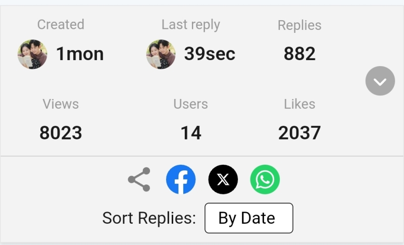
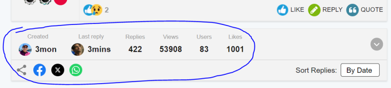
This top info part in the middle of every page is an overkill. On the very first page of the thread is sufficient IMO. Or kindly move it to the bottom where this doesn't break the flow/act like a distraction.
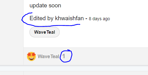
The 'edited by' is hideously big, needs rescaling. The part where only one person has liked, no point of indicating the number "1" - if it's a glitch hopefully gets removed.
The features which are useful so far is the new sorting by dates and likes.
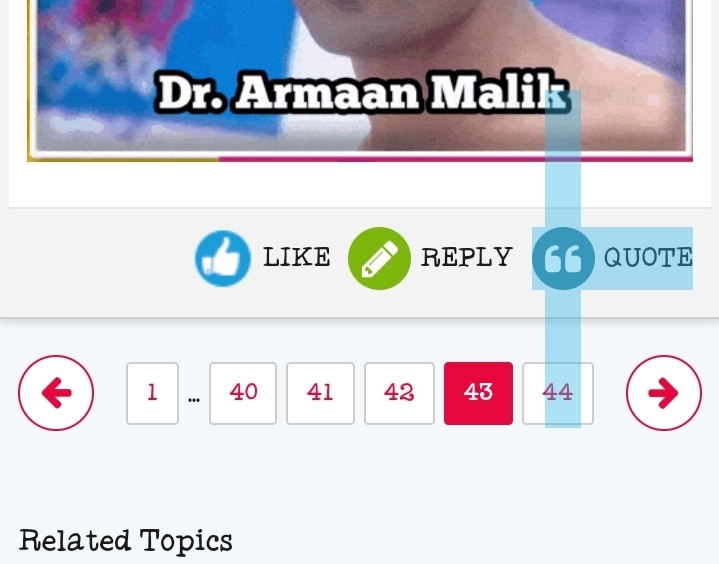
And the "expand" option for quotes - loved it.
For now, noticed these. Might update if I encounter more bugs/issues.
Regards. 🌸
I second these except that notifications thing is fixed for me now.
Originally posted by: WaveTeal
Hello team, congratulations on testing the new UI.
I encountered a few issues after the new UI update -
1. When clicking on the notification for tag, previously it redirected to the post I am tagged. Now it's stopping on the first post on the page. We need to scroll to find the post thus eliminating the basic purpose of tag/dm/ notification.
**This is crucial as if I am tagging someone or am being tagged on the very bottom of the page, I might scroll past it. Positive that it will be fixed with caching.
2. Similarly to tagged posts, when I am clicking notification for XYZ has liked my post, it again stops on the top of the page (doesn't redirect to the post the member has liked)3. Same with inbox hyperlinks. I have to scroll to find the post even though the sender has linked the specific hyperlink.
4. Loading time has increased subsequently.
5. Too many distractions.
6. The differentiating colors are either too contrasting or non-existent. Example - read or unread PMs/Notification7. The reading area(body) has been narrowed down to an excessive level. While there is too much empty space on the right side. (from desktop)
8. Clickable contents showing Typing Cursor ( | ) instead of Mouse cursor ➤
Needless to say, the UI looks quite outdated and claustrophobic. The neatness is gone. If possible kindly revert back to the previous clean interface while keeping the useful changes🙏
This top info part in the middle of every page is an overkill. On the very first page of the thread is sufficient IMO. Or kindly move it to the bottom where this doesn't break the flow/act like a distraction.
The 'edited by' is hideously big, needs rescaling. The part where only one person has liked, no point of indicating the number "1" - if it's a glitch hopefully gets removed.
The features which are useful so far is the new sorting by dates and likes.
And the "expand" option for quotes - loved it.
For now, noticed these. Might update if I encounter more bugs/issues.
Regards. 🌸
Plus one on the reading area. I just noticed on my desktop. There is a lot of space on either side.


Hi All, First off, a huge thank you to each one of you! Your active participation and enthusiasm continue to shape our community into a vibrant...


 Sports
 Music Corner


1.5k