Site Updates and Issues Discussions #7 DT note: 122 - Page 107

Announcements

Created

Last reply

Replies

1.1k

Views

105.7k

Users

163

Likes

2.9k

Frequent Posters

Posted: 1 years ago

Originally posted by: MochaQueen

It is not appealing as much as the previous look was. But I guess I'll just need time to adapt to it.

The hyperlink issue has been fixed now.

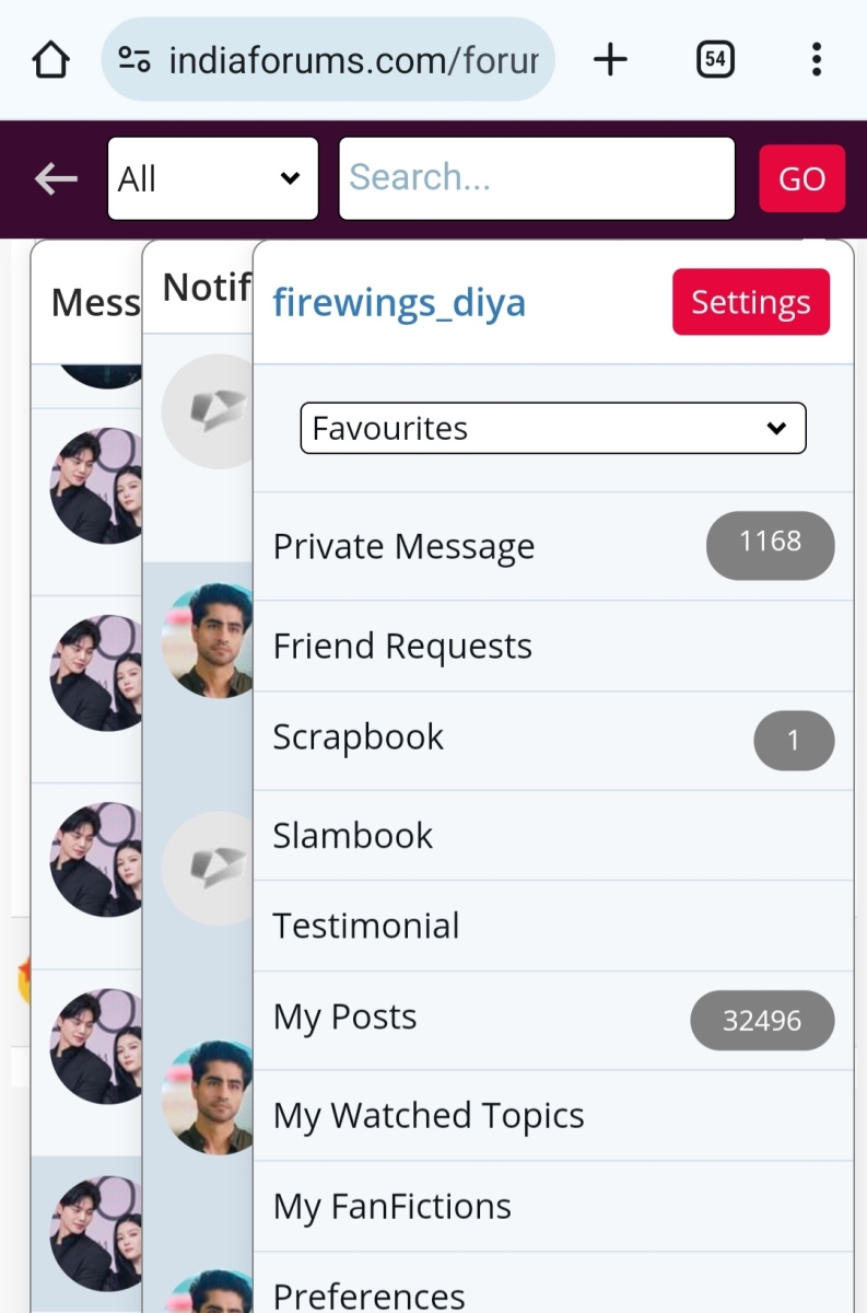
The only main issue I'm facing is that some of the text is incredibly large, especially the notifications, PMs bar, and the UNs appear very big when I'm trying to tag them.

It's hard to scroll through them due to the text being so large.


Please share the screenshot as it might be a specific browser issue. Try to refresh the page.

heavenlybliss thumbnail

Creative Minds

Posted: 1 years ago

Originally posted by: vijay


Please share the screenshot as it might be a specific browser issue. Try to refresh the page.

No, it's the same for me on all browsers and mobile too. Because I use enlarged text in settings, this makes the text look even more larger. I tried to decrease the text size, but then everything else on the page looks too small.

Basskarrr thumbnail
Visit Streak 30 Thumbnail Voyager Thumbnail 2nd Anniversary Thumbnail
Posted: 1 years ago

Originally posted by: oh_nakhrewaali

Also, the dropdowns look very clunky, especially in mobile view, like they cover more area than last time.

Screenshot_2023-12-11-18-44-20-13_40deb401b9ffe8e1df2f1cc5ba480b12.jpg


I feel the same. Can we bring back the old layout for the header. Everything appears larger and easy to miss out on notifications. The PM box icon now looks like a picture box icon. It’s weird
Basskarrr thumbnail
Visit Streak 30 Thumbnail Voyager Thumbnail 2nd Anniversary Thumbnail
Posted: 1 years ago

The whole thing looks very big now instead of light. Reminds me of forums from the 00s era.


IMG_0769.jpeg

shahsb_26 thumbnail
18th Anniversary Thumbnail Visit Streak 365 Thumbnail + 9
Posted: 1 years ago

Originally posted by: Basskarrr

The whole thing looks very big now instead of light. Reminds me of forums from the 00s era.


IMG_0769.jpeg


Quoted but unrelated to the member quoted 🙈.. Just didn't feel like uploading image on forum for getting abusive words warning.


Was Setting always Red? Why do I feel everything looks dull and that red is too on my face..


What makes it dull is blank fill for icons and smaller space for them. White fill made clicking little more intuitive... And outline is also grey which doesn't stand out on maroon colored header. White used to make everything brighter and better.

Edited by shahsb_26 - 1 years ago
Ajab.Pehchan thumbnail
Posted: 1 years ago

My account keeps logging out randomly a lot more when I visit other sites or leave the browser.

Savera84 thumbnail
Posted: 1 years ago

Originally posted by: firewings_diya

+1 on this. I faced same issue for the same user 😅 since the username was unique i still remember it. Seems like some usernames does not come up for suggestions. I don't recall usernames except this one but i remember i had to click on reply as manually tagging was not working.

I think the member is allowing only buddies to tag them. That is why you are unable to tag them.

Cheers..

oh_nakhrewaali thumbnail
Posted: 1 years ago

Originally posted by: vijay


We have made the text link wider so that entire area on clicked will take you to the View All page.

Clicking outside the notification drop-down doesn't close it, icon needs to be clicked

firewings_diya thumbnail

Helping Hands

Posted: 1 years ago

If we click on message , then notification and profile all 3 options are visible.

Can we please get a toggle option here where if we clik on profile other two will be hidden.even search button seems have similar issue as shown in below screenshot.

Screenshot_20231213-173551_Chrome.jpg

Edited by firewings_diya - 1 years ago
Posted: 1 years ago

Originally posted by: firewings_diya

If we click on message , then notification and profile all 3 options are visible.

Can we please get a toggle option here where if we clik on profile other two will be hidden.even search button seems have similar issue as shown in below screenshot.

Screenshot_20231213-173551_Chrome.jpg


Yes. This is a known issue to us and it happens on mobile devices due to the sticky top nav bar.

We are working to resolve this soon.

Related Topics

Suggestions / Comments Thumbnail

Posted by: vijay

11 months ago

Site Updates and Issues Discussions #9

Hi All, First off, a huge thank you to each one of you! Your active participation and enthusiasm continue to shape our community into a vibrant...

Expand ▼
Suggestions / Comments Thumbnail

Posted by: Viswasruti

9 months ago

How India forums as an interactive site Introduced & nurtured you ?

Soon, we are going to celebrate the 21st birthday of IF !! The 21st year is a significant milestone in many cultures and communities, marking...

Expand ▼
Top

Stay Connected with IndiaForums!

Be the first to know about the latest news, updates, and exclusive content.

Add to Home Screen!

Install this web app on your iPhone for the best experience. It's easy, just tap and then "Add to Home Screen".