IF New Design - Please test this link on your Mobile / Tablet - Page 14

Created

Last reply

Replies

1.4k

Views

138k

Users

537

Likes

1.4k

Frequent Posters

-Destiny- thumbnail
15th Anniversary Thumbnail Sparkler Thumbnail + 2
Posted: 10 years ago
Vijay. This setup is ingenious I was having to zoom in and out on my phone but now it's a little clearer.

Thanks for this.

Lekha
Sh_Abhiya thumbnail
13th Anniversary Thumbnail Sparkler Thumbnail + 2
Posted: 10 years ago

Originally posted by: vijay


The page is lengthy cause its retaining all the content and the content is visible without zooming in.

How about if we retain the option to Switch between Responsive and Current version?

Regards,
Vijay


bold : it will be great
-Zoey- thumbnail
11th Anniversary Thumbnail Dazzler Thumbnail Engager Level 1 Thumbnail
Posted: 10 years ago
It worked perfectly on my mobile. When it will be up?
taaniroyal thumbnail
12th Anniversary Thumbnail Sparkler Thumbnail + 4
Posted: 10 years ago
it's awesome for mobile... but for desktop I like the old one...
Black_Angel thumbnail
11th Anniversary Thumbnail Easter Egg Contest Winner (2022) Thumbnail + 4
Posted: 10 years ago
I liked the the current design ...
Thought i use mobile

I fell this if more Eassy to excess
Laters_Baby thumbnail
13th Anniversary Thumbnail Dazzler Thumbnail + 2
Posted: 10 years ago
I would say if u going to keep that version fr mobile it would be more interesting If there is app too !!!
Personally speaking I didn't like it , page layout is long due to content which will get boring.
pari0706 thumbnail
19th Anniversary Thumbnail Rocker Thumbnail + 3
Posted: 10 years ago
Hello Vijay bro,


I do browse through IF regularly from my iphone... and this new mobile friendly version is great for me, as i usually browse through my phone when i am on train and hence having to zoom is difficult with one hand. 👍🏼

So glad to know you are working on this... 😃👏


However when i tried the link on my laptop I am not liking it 😭 it is messing things up


unfortunately I am unable to post a screenshot for some reason 😭

Happy to help testing.
Edited by pari0706 - 10 years ago
Mrs.Somerhalder thumbnail
11th Anniversary Thumbnail Dazzler Thumbnail + 3
Posted: 10 years ago
I hope we would be also allowed to log in from multiple devices at once after this design is generated and put to use.
Edited by drashtifan1 - 10 years ago
Serviana thumbnail
12th Anniversary Thumbnail Stunner Thumbnail + 3
Posted: 10 years ago
The news preview part is distorted for me...checking it on my ipad
Sutapasima thumbnail
Posted: 10 years ago

Originally posted by: vijay


That is what we are doing 😊

We are just making the old one mobile friendly by making it responsive so that site visitors do not have to zoom-in everytime and its easier to read and navigate.

Cheers,


This is what I felt when coming thru iPad , kindly consider my points

Do we need the blank space just below the IF logo on the top left side
What do you plan to add there Vijay ??

We need to make better use of the spaces in the of "global announcements "and "Gen discussion forums ".. In stead of leaving spaces we might make the fonts bolder
Or add more words/topics there ??

For me both the versions Desktop version n responsve versions are idnetical
I come thru apple iPad

Thanks for listening to our views dear Vijay
Hope we get the best site at IF
Cheers to every body
😃

Edited by Sutapasima - 10 years ago

Related Topics

Rules & Announcements thumbnail

Posted by: vijay · 6 months ago

🎉 New Member Profile Design + Profile Banners Are Here!

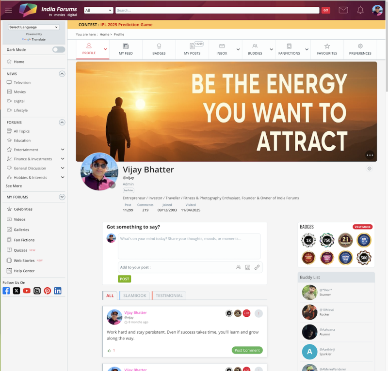
We’ve given the Member Profile Page a fresh new look! ✨ You’ll now see a sleek redesigned layout that puts the spotlight on you — with the...

Expand ▼
Top

Stay Connected with IndiaForums!

Be the first to know about the latest news, updates, and exclusive content.

Add to Home Screen!

Install this web app on your iPhone for the best experience. It's easy, just tap and then "Add to Home Screen".