
Bigg Boss 19: Daily Discussion Thread - 15th Oct '25
Bigg Boss 19: Daily Discussion Thread - 16th Oct 2025

Yeh Rishta Kya Kehlata Hai October 16, 2025 EDT
KARWA CHAUTH 15.10
NOODLES VRATH 16.10

Sonakshi Sinha Pregnancy Rumours
What will Yuvraj do?
Welcome Back 🥳
Pankaj Dheer Passes Away

Pari and Mitali
This is concerning.
Who is most loved character in gen 4?
Kyunki Detailed Written episode Oct 16. Pics attached (Hindi captions)
Acha wala gunda
Wanna see post leap trp ?????? Geetu vs Abhimaan romance who won??
Mental health club - Only Positivity allowed 🌟
i support farhana
Originally posted by: Brahmaputra
Where has the hyperlink button which was seen with quote & report icons suddenly disappeared? How do we get the link of one exact comment now? I don't wanna waste hours in 'my posts'?
Originally posted by: Brahmaputra
Well, I'm not seeing it but all.😆 Not even my profile picture. Is it still the same small dark green-blue bubble?
Originally posted by: KhotaSikaShreya
<font face="Georgia, Times New Roman, Times, serif" size="2">Vijay bhai this speed thing is becoming a bigger issue now. Can something be done about it? Now it's taking a good minute and half for a page to load and then if I have to scroll to the bottom I need to wait another 30 or so seconds for the page to load properly because if I click before that I usually end up clicking on the ad or on the wrong button.</font><font face="Georgia, Times New Roman, Times, serif" size="2">I don't know if it has something to do with the tab that you removed, but ever since that tab has been removed the speed has slowed down even more. Please look into this.</font><font face="Georgia, Times New Roman, Times, serif" size="2">I only use Chrome (both laptop and mobile) and the speed eats into my battery power and net usage both.</font>
VijayThe speed thing that she mentions, I'm noticing that as well. While flipping pages within a thread, it loads slowly initially, due to the flash ads that we have. I know they pay your bills, but do we have to have the same ads both at the top and at the bottom?Also, I'm not noticing any difference when I switch b/w desktop or responsive - either on my laptop nor on my phone. Also, the TB articles page still has the old layout, which is painful on the eyes on a phone.Also, the login issue - are we now able to simultaneously log in to 2 devices w/o being kicked out of one? Or at least, if we log into say the laptop, and later on, when the laptop browser is closed, we start the phone browser, would we still have to re login?On the mobile version, I like the white header. One more suggestion - the button for desktop/ responsive version - instead of the bottom of every page, can it be in the top - maybe as a part of the white header? Or even both? Also, can we have an option to prefer one layout for desktop and the other layout for phone - whichever it is, so that each time we log into a platform, we're not confronted w/ the 'wrong' choice for the platform?My platforms again:laptop w/ PC-BSD and Chromium (my choice of browsers are Chromium, Firefox, Konqueror and Web/Epiphany. As you probably know, Chromium is almost identical to Chrome, both being from Google)Lumia with Windows Phone 8.1 and IE11. (Haven't downloaded Opera, Firefox or Chrome on this one)
Originally posted by: -DevilGal-
I have nothing against new design ...but I face this problem whenever I opened something its went blank & I need to reload it again & again then its got fine but its annoying ...here is the shot


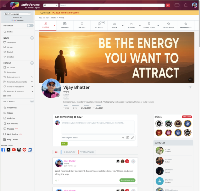
We’ve given the Member Profile Page a fresh new look! ✨ You’ll now see a sleek redesigned layout that puts the spotlight on you — with the...


 Udne Ki Aasha


36