Tutorial for animated Text : "Color Sync"
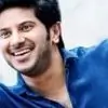
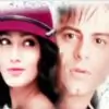
Ex:http://i.minus.com/i6HXyP3JQc6Zk.gif (credit:18shabbo) thats me!) __
Requirements: Any version of PS , as I use PS v.8.0(the oldest).
I'll be working in IR(image ready) as I find it easier.😛
Fonts: Metro Retro(caps) : Windsong( lower)
We'll be making it exactly the same. Note: Follow all the screenshots(SSs). I have made it a big tut with almost all essential and non essential but important SSs. Step1: Open a new transparent document , size your choice(as I work on big space).

Use
'Type Tool' to type
'TellyBuzz' with a Grey shade
(#999999).
Then by Selecting 1st
'T' and then
'B' change their font type to
Retro Metro.
And following that , select ,1st
'elly' and then
'uzz' and change font to
Windsong , respectively:

__
Step2: Now keep the
Text layer selected in the
Layer panel and by either going to
Layers<Layer Style<Outer glow or by simply
right clicking on the Text Layer , apply
Outer glow to the settings as shown in the screenshot:

 (^the details in the Red rectangles are the magic workers!!!)
 __
Step3: Duplicate this
Text Layer and by keeping it selected in the
Layer panel , go to the
Outer glow option again and change it to the following settings:
 (^duplicated layer in Grey)
  (^Outer Glow settings for Duplicated Text Layer.)
 __
Step4:Now make a
New Layer ,below the
Original Text Layer.

And keeping the
Original Text Layer(Layer just above Layer 2) , go to
Layers<Merge Down , or simply do
Ctrl+E: 
You'll see that the
Text layer will be changed to a rasterized layer(mine is
Layer 2 in red):
 (^So now you have a duplicated text layer and a rasterized layer)
 Now go to the
animation tab and duplicate the frame1 twice , so that you have 3 frames in total:

And keeping
frame 1 selected in
animation tab and
Layer 2 selected in the Layer panel , either
right click it or go to
Layers<Layer Style<Drop Shadow , and apply the following settings:


__
Step5:Now we make the Sync.
Set your foreground color to
Orange(#FFA929) and background to
White(#FFF) and by keeping
frame 1 selected in the
animation tab and
layer 2 selected in the
Layer panel , either
right click on
layer 2 or by going to
Layers<Layer Style <Gradient Overlay , apply these settings:

__
Step6:Gradient Settings:
For Frame 1  I have edited the Gradient manually so that very little orange comes at the top and the rest is white , follow the next screenshot to see how to do it:
  Frame 2
  Frame 3
__
Step7: Now we will time the animation.
Left click the small triangle(in red) on the
animation tab and
select "All Frames." 
__
Step8: Now as you can see theres an inverted triangle just next to
"0 sec" , left click it :

Choose
"Others..." and put in your desired time:

See that your timeline is set to
"Forever." Run your animation and see if everything is to your liking and save it.
You are done with it!
The tut ends for those who work on small documents and did not open a 550*500 one.
(Refer to add.Step10 for the results)
__
These additional steps are for those who may do exact to
what I do and have mentioned the same in this tut. add.Step9:As you can see I have been working on a very big workspace(550*500) ,
so the non-required area needs to be trimmed off.
Note: I work on big work space , because it gives me place to rough work too , its not necessary to work on big documents when you know that your animation needs to be small , but its my personal preference.
So to trim , Go to the
Menu bar and find
Image<Trim:

These are my trim settings:

It reduces the document to a perfect size:

____
add.Step10: Now if you feel that your animation is very close to the document edges
and may get cut off from sides when you save it ,
and feel to give it some "breathing space" then do this:
Keep
Layer 2(the animated layer) selected in the
Layer panel and go to
Image<Canvas Size...": 

You will have the original size there ,
from which you can increase it to some extent( your desired) and click OK:
 Run your animation once and if all is good save it.!
 __
A Trick of sorts: Someone asked me as to why some of my animated stuff have a Grey Background when its viewed in a web browser.
The answer to this is that , we save animated stuff in GIF format , which is a very low quality filing option , so sometimes without a BG the animation
looks very jaded or untidy around the edges.
So I use color #F5F5F5 , which is the BG color of India Forums and apply it on an empty layer which is at the very bottom , with the help of a bucket tool: 
 (^bottommost layer in purple)
 Now when this animation is posted anywhere in IF the BG mixes with IF's BG , thus you don't see it.
Here are the end results of the tut:
Without a Grey BG:

With a Grey BG:

___
Hope this tut helps you work on animation texts in unconventional styles.😃
PS_ I never use stroke , ever , so if you want to know how to work this with strokes , I'm sorry but wont be of any help.😳


 Tum Se Tum Tak


850