


Posted:
Originally posted by: .moonglade.
Any better?

If I may? 😳
I'm no expert myself but I was just roaming around here and happened to see this and I thought may be I could help a bit. Whenever you're attempting to make a blended gif of this sort, remember the following pointers. There are, of course, no standard rules for this but these generally do tend to help.
* Decide the focal area of your subject. Whether its the faces or particular area of their bodies (like hands, eyes etc) or the complete profile. The body edges don't necessarily have to be precise or be seen. Your focus area should be the determining factor. Depending on that, eliminate what's not so important to be seen. For instance,

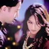
The focus here is on the moment or the subject as a whole. Almost everything in here can be seen, their faces, body structures, hands, etc.

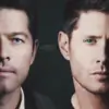
Whereas here the edges of their respective dresses or their shoulders can't be seen as they're blended in closely which helps in giving it a neat look as the focus was on their faces.
* Facial proportion is one of the crucial elements.
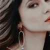
Up there in your gif because you perhaps wanted the girl's shoulder to be visible, you ended up overlapping her should over his side of the body which in turn makes it look like there's just the guy's head there. For instance again,

This too has a similar layout where you have the girl's profile complete, nice and proper but you have to work your way around with just the guy's face which is likely to look abnormally large if it isn't positioned, cropped and blended in right. That seems to have happened with your gif. If you have faces that are adjacent to each other (like in the example above or in the first example or the one below), it's better to blend their faces as closely as possible, even if you have to compromise on a bit of their faces (like ears). Gives a proportionate look.

However, if you have scenes that are likely to shift (like the one below), it's better to leave some space in between in order to avoid one gif overlapping the other. You could either place texts in that area or some texture or just leave it as it is.

* Play around with blend modes, choose brushes wisely to blend and use suitable dimensions for the gif/signature.
Depending on the kind of scene you have at hand, play with blend modes accordingly. 'Lighten' mode is mostly commonly used one for blending gifs followed by 'soft light', 'darken' and 'normal'. I believe you used 'normal' which again doesn't seem to have helped you in achieving the right look. For brush to blend, it's always better imo to use a soft round one with no sharpness as it helps achieve a neat, soft and uniform look overall. Lastly, the gif sizing matters quite a bit too.
Here's what I'd suggest you to do.
1) Since almost nothing can be done to the man's gif to be able to fit in properly, scale the girl's gif in such a way that the focus is on both their respective faces. That way you don't have to worry about the edges of her body being seen. Use dimensions as 500 (w) x 250 (h) for your canvas/base and see if it makes a difference.
2) Their facial angles aren't adjacent in this one, so you'll have to blend it in such a way that his hair & left ear is either blended in completely within her hair or are simply not seen. Try blending their faces as closely as possible maintaining the proportion. Go for 'lighten' mode to blend instead of normal.
3) Once you have the blending in place, choose a coloring that gives a darker & deeper result than in this one. Place the text in between in a non cursive font and in much smaller size and may be under the 'soft light' mode.


 Seher Hone Ko Hai
 Cricket


4