


Posted:
the best part of tumblr stuff is the neat bg removal, like dips here didOriginally posted by: Carmilla
I don't really like Tumblr icons or find them pretty actually. 😆 Too ordinary for my taste. I like deep intricate heavily layered stuffs that blows the mind .Like LJ icons . 😆Gives feels .Makes me think of layered sweet meats.Yeah actually I learned the importance of icons from LJ only . Or I was like , why'd one devote a darned lot of precious time , energy and work on tiny things like icons .

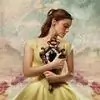
probably she tinkered it a bit once the size was less but this is hella time consuming stuff. like i tried making this

original cap is  if u look closely the hair part is uneven but i erased it once the size was low.
if u look closely the hair part is uneven but i erased it once the size was low.whats same in both sites icons are they *mostly* put the subjects in a transparent new document after removing everything bg junk, then texture (lj) and tumblr. now texture is tricky, u never know what looks good. just experiment and see. everyone's work comes out different even if they all work on single caps.
actually we should try this. take one cap and try to make icon, we will see how we all work differently and learn from each other😆


 Book Talk


37