


Posted:
Reserveee.
Congratulations Madz, Akshu and Sneha. :)
I'll unreserve within the next century. (Hopefully!) 🤣
P.S Madz, you're thanking me? For what woman?
Edit.
Finally unreserving. Yes, miracles do happen.
Before I give you the comment, congratulations again on opening this shop. Am exclusive;y RaHi shop is quite a unique idea.
Also, a Hello to Sneha. WE haven't really met before but we get to interact with you in future. : )
Now, out of all the icons the one i like best is:
Madz, the set icons you've made with Mansi's PSD would have looked way better if the cropping was just a little bit better/ hope you look into that in future.
Akshu, I like the blending on this one - http://i.imgur.com/f0zC7YK.jpg. However, the colouring needs to improve. You should just try using more of the effects. Keep experimenting, you'll eventually get it right. :)
Madz, http://i.imgur.com/lnjERZo.png - this looks really good. I like the way it's been made. http://i.imgur.com/he1KeEm.png - would also have looked good if it weren't for that one picture of Panchi's on the left-most corner. Somehow, it doesn't go with the whole edit. I can't seem to remember where but I've seen this before - http://i.imgur.com/YnxNs0r.png - and it looks good.
Sneha, http://i2.minus.com/jmMs7z2rj6Ii9.png - I like it. The blending and the colouring are really nice However, I think you should have used a different font. just a suggestion. http://i2.minus.com/jSL35EbQj0vls.png - This one I really like. One of the best on this update I'd say. : )
Madz, the colouring on - http://i.minus.com/ihPChdGyb36Fi.gif - looks awesome. http://i.minus.com/ibkMJvVtsqnbBn.gif - I like what you've done here. Good work. http://i.minus.com/iCcgnnxPVUa2n.gif - these looks good too. : )
Ah, finally done.
Keep up the good work women and Thanks for the PM. :)
-Srishti

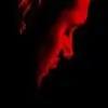

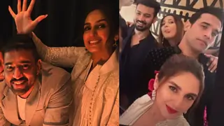
 <-- the best! the coloring looks bright and gorgeous.


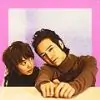
 <-- this is so cute.
  <-- I want the original! 😆


 Kyunki Saas Bhi Kabhi Bahu Thi 2
 Sports
 Current Affairs
 Sadda Haq Season 2
 CID
CID
 Jhanak


112