


Posted:
It’s uncomfortable to use currently and this is very bright and will have impact on our eyes as well. Previous one was spacious and well organised as compared to the recent one. Not liking this new UI.
It’s uncomfortable to use currently and this is very bright and will have impact on our eyes as well. Previous one was spacious and well organised as compared to the recent one. Not liking this new UI.
Hello,
I am unable to log out. Can you please address this issue? I never faced this issue on IF before. But it's suddenly happening today.
The pagination has been increased cause it was difficult to click on them on touch devices.
I have always used IF on phone and previous interface was much user friendly and organised to use, including clicking on page numbers.
The color sceme is totally off!
I just woke up and came to the site and thought I was in a parallel universe until I saw that this is reality. I don’t know what to think but some things like the box and expand is weird etc.
On the phone, the link in the signature is going out of the area which is causing the page to move side by side also instead of just scrolling up and down
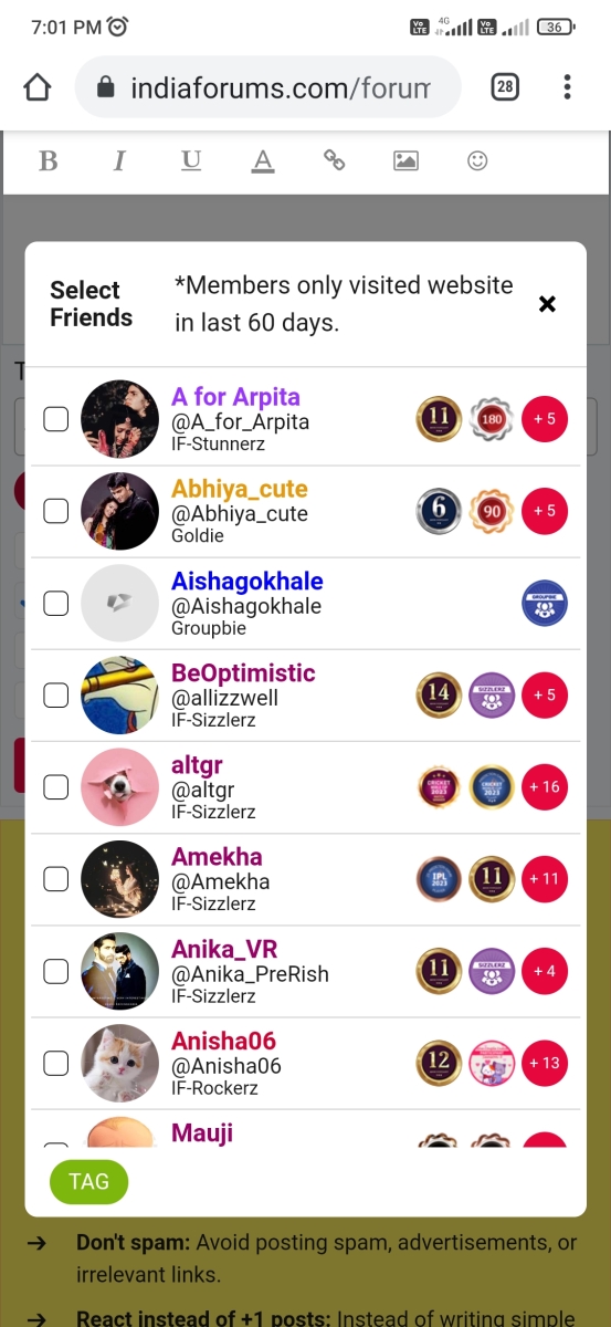
Nooo!! I absolutely don't need any of this info when I'm tagging my buddies. Just their username and display pic is enough!
Colours already tell us what ladder they're on.


You know what?
Sahiba deserves the Brars
Let me them all be together.
Hum users Saath saath hai.
Viswasruti wrote:
It is very easy to find out , when the thread started, by whom it was started, likes--views-- posts every info on every page's first post.
There is no reason to display this information below the first post on each page of the topic. Footer between posts should be uniform.
Topic Starter etc. used to be displayed on the right hand side where the Topic Users button is, and that is where it belongs.


comment:
p_commentcount