IF New Design - Please test this link on your Mobile / Tablet - Page 39

Created

Last reply

Replies

1.4k

Views

137.9k

Users

537

Likes

1.4k

Frequent Posters

nhrb thumbnail
12th Anniversary Thumbnail Visit Streak 30 Thumbnail Navigator Thumbnail
Posted: 10 years ago
So confusing.where is my forum option?
sara5471 thumbnail
11th Anniversary Thumbnail Voyager Thumbnail
Posted: 10 years ago
I am not at all liking this one. I wish there was an option where we can switch to the old one.
Please change the phone version also. It looks too weird. Plus it is eye jarring 🤢
BeingBlunt thumbnail
Posted: 10 years ago
Please Change to the old layout Vijay. Even if you want a uniform design for both. Please retain atleast the old toolbar below the dashboard. I have no problem with this except for the disappearing of the toolbar below dashboard.
Rasgulla_sp thumbnail
13th Anniversary Thumbnail Trailblazer Thumbnail + 6
Posted: 10 years ago

Originally posted by: Rasgulla_sp

I am someone who logs into IF with my cellphone 99% of the times.

Currently the design is the exact image of my laptop screen. That is, the entire home page is visible in one view and I have to only zoom to click on the desired link. The news articles, the video links, the various announcements and rankings everything is just there and I only need to click. However, with the new version everything has been laid out in a single column view. That doesn't require zooming as everything is large enough but it has made everything crammed up and looks messy. Also I have to scroll all the way down to reach any link.

But I can live with this. What I seriously had an issue with is this- In the current version of IF everything from 'Inbox' to 'Logout' is right there before your eyes. I just need to hold any of these buttons and then click 'open in a new tab' So when internet is weak I just have to refresh the additional tabs I have opened. However, here I had to click on the red icon with 3 horizontal lines to reach the 'Home' to 'My Dashboard' menu. Still the 'Inbox' to 'Logout' menu was missing and clicking on 'My Dashboard' made it available. You do realise that you are making us move from an easy single click navigation to multiple click navigation? That's not user friendly. Also, if the internet is weak, I can only pray the red icon doesn't give up on me.

Next, when I refreshed, all the menus disappeared, leaving me back to the home screen. Clicking on the red icon got me to the rest of the menu but clicking on 'My Dashboard' didn't load the next menu. I tried several times. I had to close the entire site on the new version then re-click on the link you have provided and then click on the red icon and 'My Dashboard' to get the second menu. From there then I could access 'Inbox' etc. (instead of directly hitting on Inbox like the current version) I tried this step several times and I always had to shut the new site to access 'My Dashboard' again.

I tried to right click 'My Dashboard' to open it in a new tab. Instead of just that detail loading (so that I access the second menu) the Home screen loads again. Urghh!

Wait! Now even shutting and reloading the new site didn't help in loading my 'My Dashboard'

Please spare me the torture and do NOT introduce this horror. I am completely happy with the current version.

Btw, I use some Samsung Galaxy phone


I don't even know if you had read it when I had typed this essay on my phone. The desktop version is a more unresponsive version of your responsive version. The dashboard just won't click!

The responsive version is big and not user friendly at all. Instead of zooming in just once I have to first click on dashboard and then access my personal profile and its menu. Why would you do that?

The posts are also too big and one page doesn't fit on one screen, only one comment does. So I have to scroll all the way down every time to check instead of just zooming if and where I have to be

I do not like your responsive version and your modified desktop version sucks more. Where can I find the classic IF?
Edited by Rasgulla_sp - 10 years ago
Jais1 thumbnail
11th Anniversary Thumbnail Voyager Thumbnail
Posted: 10 years ago
Hey, please give back old one design or setup. Old one was really very good and quite friendly and also i could access old one quite easily but this new one it is really very irritating and above all take more time than before.
Please sir, if you do no mind give also option for old one. It was very good.
ELLUNDAA thumbnail
12th Anniversary Thumbnail Voyager Thumbnail
Posted: 10 years ago
Please this version is not convenient at all...how to switch to the old version?????
Please make an arrangement for that...its confusing n lengthy n have to scroll down unnecessarily...

The earlier version was user friendly...this isn't...
I request you to make an arrangement to switch also...so that the ppl who aren't convenient can switch and ppl who like it can use it...
Please I am finding it hard to use...
Annie- thumbnail
12th Anniversary Thumbnail Voyager Thumbnail + 2
Posted: 10 years ago
Please change it back to the previous one.
I use it from my mobile and its very hard, difficult to use.
EchTee thumbnail
13th Anniversary Thumbnail Dazzler Thumbnail + 3
Posted: 10 years ago
Pls change it to old one...
Its really bad
Penkie06 thumbnail
11th Anniversary Thumbnail Sparkler Thumbnail + 3
Posted: 10 years ago
Too bad it is! Plss change it to d older one!!!
Infinity. thumbnail
14th Anniversary Thumbnail Stunner Thumbnail + 2
Posted: 10 years ago
Please shift to old one

Related Topics

Rules & Announcements thumbnail

Posted by: vijay · 5 months ago

🎉 New Member Profile Design + Profile Banners Are Here!

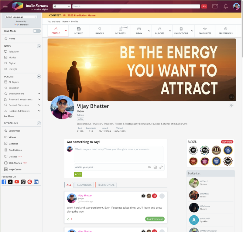
We’ve given the Member Profile Page a fresh new look! ✨ You’ll now see a sleek redesigned layout that puts the spotlight on you — with the...

Expand â–¼
Top

Stay Connected with IndiaForums!

Be the first to know about the latest news, updates, and exclusive content.

Add to Home Screen!

Install this web app on your iPhone for the best experience. It's easy, just tap and then "Add to Home Screen".