


Posted:
New designs is a torture for commenting
I should post empty comment box and edit to write my comments , can you do something about this ????

Bigg Boss 19 - Daily Discussion Topic - 25th Oct 2025 - WKV

PLAN CHANGED 25.10

🏏India tour of Australia, 2025: Australia vs India, 3rd ODI, Sydney🏏
Yeh Rishta Kya Kehlata Hai Oct 25, 2025 Episode Discussion Thread
PICHLE JANM KA PUNYA 26.10

Actor Satish Shah Passes Away
Yeh Rishta Kya Kehlata Hai Oct 26, 2025 Episode Discussion Thread
Clip of Deepika justifying infidelity and cheating is going viral

I'm disgusted
The Girlfriend - Rashmika - trailer out now.
Sooooo Happy with This Weeks Elimination
Ram Aur Shyam By Anees Bazmi
5000 Episodes..
Kyunki forums beats yrkkh forum
Alia's agenda behind friendship with Katrina
Originally posted by: devina22
Now how do I go to my posts ?
Even after going to home page going too Telly buzz and then going to wassup so can go to my posts not working --hate this new format
Have to go history scroll down where I can find the old format what happens once I have cleared the history ?
The fonts(including the member 'likes' under posts) look too kiddish!
VB, the old version was MILES better. 😳 And truly, that bar is annoying 😡 Even the responsive version, it's really bad.
Originally posted by: devina22
What is going ?
This new format is awe full everything in the back ground is red with purple writing and the comment square is so tiny and only thing white in the whole page canno see where the my posts etc are --very annoying
Pls go back to the old format

Originally posted by: serendipity.
Can the annoying tabs on our heads that follow us all the way down PLEASE be removed?!?!? the buttons are all so big now, plus the Dashboard/Home navigation option is HUGE following as we scroll, the page view is very disturbed... only a small part can be seen!
How many times and How many people have requested for that Vijayy! 🤔 😕
Thank you for your feedback. For desktop users we will be removing the scrolling Navigation Bar (Red) feature soon.Regards,


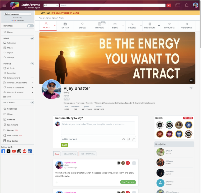
We’ve given the Member Profile Page a fresh new look! ✨ You’ll now see a sleek redesigned layout that puts the spotlight on you — with the...


 Udne Ki Aasha


36