
🏏T20 Asia Cup 2025: UAE vs Pak, 10th Match, Group A at Dubai🏏

BACK TO MUSSORIE 17.9

Bigg Boss 19: Daily Discussion Thread - 18th Sept 2025
HEALING SHUROO 18.9

Premiere - The Ba***ds Of Bollywood
Akash Ambani constantly holding radhika's hand and waist
Yeh Rishta Kya Kehlata Hai Sept 18, 2025 Episode Discussion Thread
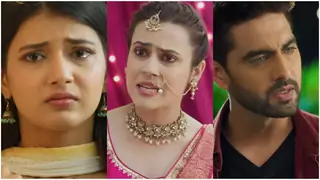
Soo EMA or SR?

Anupamaa 17 Sept 2025 Written Update & Daily Discussions Thread
🏏T20 Asia Cup 2025: AFG vs SL, 11th Match, Group B at Abu Dhabi🏏
Deepika Removed From Kalki 2
Abhi-Ash Separation Rumours Is Garbage
Bollywood Celebrates Modi's 75th Birthday
The Ba***ds Of Bollywood - Reviews
Abhishek reminds me of young Puneet Issar
And Ranveer Singh was never the same anymore after that day

ABC Pulls Jimmy Kimmel Off Air for Charlie Kirk Comments
Who is more beautiful? Mariah Carey or Kareena Kapoor?
Buddhiya ki Nautanki
Anupamaa 18 Sept 2025 Written Update & Daily Discussions Thread
Originally posted by: fizzwizz
feel free to use and do comment


I loveeee the fact Faru, that you tried something different here!
You kept them soooo simple, no birds/spiral notebook/ extra
text or textures/brushes however you call them. They look verrry
SIMPLE, very nice and elegant! I love the change in colour..
the colour effects- not fully colour, not black and white either..
a bit in the middle! Suits the pictures very well, lovely!


Ahhhhh. This ONE, is BEAUTIFUL. That's the word.
Picture is BEAAAUTIFUL. Creation is BEAUTIFUL.
Whenever I look at the picture, I always think of it to give me a sorta
flower-ish effect, and your icons keep that feeling alive!
I mean, I really really really like the fact of just having plain simple
coloured icons- with nothing extra.
It just works the best. I might sound repetitive, in saying your work
is so simple so simple and classy, but I think that's important,
coz that is your best asset- your best point! You know, when to make
it elaborate, and when to keep it subtle and nice😳


This is the GEM/STAR of the update.😳 The icons update, siggy yet
to come😆
I love this! You know, I was going on about simplicity, but for
some reason- I am loving this elaborate style. It looks simplyyy
aweesome!
Firstly, GREAT choice of pics for icons. Second thing that
stands out the mostt is the colour co-ordination.
Faruu- did you realise, how you have used the CONFESSION colours?
For the texture- for Ridz Icon you used a blue texture, and Armi
one you used a pink texture...I loveeeeee the combination!
It blendss in soooo well. I am justt loving yourr work.
I alsoo like the glow/colour effects on the icon pics, looks FABBULOUS!
I am surelyy using this one!
Aiiii Aiiii!!!!! WHATT ICONS!
I would alwyas think, why does Faru never make icons? Why?
Then once I had told you to, well requested...and a bit after that
you made Sona ones. The day I saw those, I was like OMG.!
If THIS, like those Sonaa ones- are your FIRSTTT few
I wonder how outstanding you will be at making them after more
practice!
I have completely lost the number of count, as in how many
various different styles you have used on your icons!
Althou- my fave one is the Sakina icon one..just love that😳
Theseee are just WONDERRRFUL!


Hey there! I'm Leena, and along with my trusty sidekick (my PS :p), and give you a warm welcome to Arcanum Tutorials. After a lot of...
Hey friends Welcome to Questions Queries Corner Please post all your questions queries here instead of making new topics. If any "help" topics...
Anim a t e d N o nAn i m a t e dR e qu e sts Wanna get your request done without waiting for too long? Well then this is the place to place your
This thread is "Creations Exhibition #5 " where you can show off your latest work. And it is for everyone including members who have a...
Hello everyone, Welcome to Avatar Signatures Shop Forum Banner Contest Winner Announcement Thread. First of all, thank you to everyone who...


 Members Lounge
 Book Talk


37