Lesson 4
Tags: Level 2
What I'm going to explain:
As you probably know from the previous tut, you should always have a rough idea of what you're about to do (and be prepared to make something totally different 😆) and have the materials right close. BTW, it's okay if you don't have the stuff right there and want to figure it out on your way, that's just another POV for the process. 😳
First step of all, get a transparent canvas of your preferred choice, and put the PNG that you'd like to keep in focus.
And then find other vectors that comply with your choice of the theme.
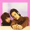
After some deliberation and a few unsuccessful trials, I found the PNG of these two kids having fun, got a clock (to emphasize 'love is timeless'), a lamp post, dangling stars and a lot of clouds.
Now, it's important that all of the vectors must be distinguished from one another. In this one, I only needed to separate the stars and the clock.
So, just like the previous tut, I duplicate the stars waala layer, place it beneath the original layer, and increase the "Lightness" to 100 (ideally, use a brush and <ctrl+click> to paint it to #f9f9f9) and move it about 1-2 pixels so that the border is visible (ignore the strawberries please, I placed the clouds later 😆).
But this looked very mainstream so I decided to add a bit more of spice in it. So, I selected the clock and inverted the selection (ctrl+shift+I). Then first erased the white star-borders from all points outside the clock, and then went the strings to which the stars were attached. This gave the graphic the look as though some random stars were hanging around the clock, and the stringed stars looked as though they were inside the clock! 😃
(^Those are the clouds there. 😳)
Now, comes the main part. The text. I went with "Be my Valentine" with the font Cassannet Regular. 😳
I the found a good crystal-like texture, and placed it in the overlay mode right over the text. Now, I right-clicked over the texture layer and selected the option "Create Clipping Mask". This confined the texture to the boundaries of the text layer, and gave it a cool new style (as you can see in the pic below!).
And now I right-clicked on the text layer again and selected "Release Clipping Mask" and went back to where I was. Then, I simply hid that layer, and kept it for future use.
Then, to make a shadow (apart from the drop shadow tool) I duplicated the text layer, rasterized it and then applied Gaussian Blur (set to 0.9).
Now, I altered the foreground and background colours (the two little boxes in the bottom-left corner) to colours that suited the mood of the graphic i.e. yellow and pink. Now, I go to the little fx button an the bottom of the layers panel and select "Gradient Overlay".
When you open the menu first, the gradient panel will have only black and white colours but when you press that panel you'll be able to see the combo you've chosen for your graphic. So you'll have to click that.
Now, we need this text to be animated right. So what I did was, I set the angle to 60 degrees. Next, I duplicated my text layer (along with the texture) and double-clicked on the option gradient overlay which then had appeared beneath the text layer. When the menu popped up again, I changed the angle from 60 to -60. I repeated this process twice more and got 4 text layers in total.
Now, there are 4 angles required for a fast, clock-wise rotation such as this, which are 60, -60, -120, 120 (remember the order). Alternatively, you can also have 90, 0, -90, 180, and so on. The key here here is to add/subtract 90 degrees with the current angle. But even that's up to you, because this set-up would yield 4 layers..you can have 6/8 or even straight 180 layer of rotation.
More layers make the animation smoother but slower, so you must judge your requirements and adjust the layers accordingly. 😊
Okay, I'd now got 4 text layers and 4 texture layers. Now, here comes a bug. In your versions of PS you will most probably find an option (in the right-click menu) called "Rasterize Layer Style" so you gotta select. But my version, i.e. CS5 doesn't have it, so what I did was to create four new empty layers and merge them with each layer of the text (select both text and empty layer and press ctrl+e). Now, we would position the 4 texture layers above each text layer and create individual clipping masks for them.
When I was done with them, I created three noise-enabled (see prev tut) layers of the clock.
Making new frames, I looped the text animation to 4*3 while keeping the clock-noise layers as 3*4 which ultimately fell to 12 layers in total.
And then as usual, I got rid of the BG white layer, and saved it as "Save for Web"/<ctrl+shift+alt+s>. These were my settings for the same.
I hope this was helpful, and, questions are always welcome. Thank you!
Edited by rai-kishori. - 7 years ago


 Music Corner
 Tu Juliet Jaat Di
 Hindi TV Shows
 Anupamaa
 Sports


37