
Bigg Boss 19 - Daily Discussion Topic - 27th Sep 2025 - WKV

DIL DOORMAT 27.9
Yeh Rishta Kya Kehlata Hai Sept 27, 2025 || EDT
Sabse Nalla Kaun in gen 4

Book Talk Reading Challenge: open to volunteers

Anupamaa 26 Sept 2025 Written Update & Daily Discussions Thread

Is noina mandira post plastic surgery?

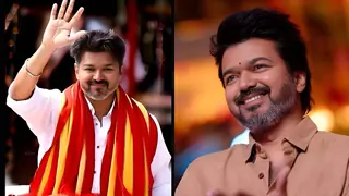
70th Filmfare Awards Nominations
BOOTH ROAMING 28.9
Yeh Rishta Kya Kehlata Hai Sept 28, 2025 EDT

CID episode 81 - 27th September
Revisiting 90's nostalgia
SAMAR ki hogi re entry !!
Diana praises Deepika Padukone’s work ethic
Ranbir Kapoor Birthday Celebration Thread 🎂🎂
Mihir ka Noina pe ato..oot vishwas

🏏T20 Asia Cup 2025: Match 19 - Final: India vs Pakistan @Dubai🏏


 This Icon is so Nice. appropriate texture used and coloring is so good too
  This one is the best Icon of all. Really loved the way it came out This one is fantastic. The way you have cropped it and used the texture behind makes it GORGEOUS ❤️


 Music Corner
 Geet - Hui Sabse Parayee
 Advocate Anjali Awasthi

