


Posted:
Originally posted by: Xx.Sri.xX
I still didn't unedit my Previous post and u got another update!😳
I will comment on this first! Do it before there comes another one. 😃
Manasi..this update seriously looks nice with different colorings and styles!
Coloring on Kash Icon stack..is waht made it beautiful!
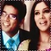
That Arjuhi icon..beautiful sepia tone..!Thanks a lot. <3I loved Kajen Icons- but it makes picture look a little bit unfocused? That is the effect I wanted to give. I wanted to soften and liquify them, keeping them real was not in the To Do List, anyways. 😆Dp icons look vibrant!
Haha..SneKti-I like hearing that- i kind of agree and disagree with coloring..as i find all lovely expect 2 and and may be 4th one..other's in stack look good..and i think that is also because of quality of pic! Quality of second was not good, fourth was okay. I can't blame the quality there, for it's the colouring that turned out crap. I don't like them much.SI-I love this stack..it came out awesome!
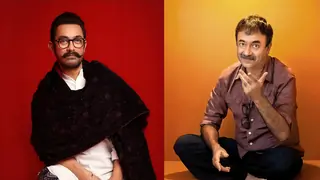
I kind of liked black BG on Dp-RK sigg..but i love this -http://i.imgur.com/EhXv8Lu.jpg..Dp is awesome..nice coloring..looks vibrant!
BS-Nice Blend!And cool text!
Arhi- i love how u used green tone on it..light leak/gradient?Whatever looks awesome!
Swaron-Again with the cloring..it looks awesome and light texture compliments it well!
Arjuhi-I love this as much i liked icon:)Thank you so much, Sri. Means a lot. :)Kash- Nice border and blend..not sure of coloring..looks dark at some places n light at other?Picture quality i guess..but loved the text!One pic was HQ and quite clear, others were 240p.. lol! So that's why the colouring didn't blend well.
Overall Beautiful!!
Sri.
P.S:Will try unediting previous post soon :(Thank you again, and no worries, tbh, take your time. I am free, this doesn't mean everyone has to be free. :p


 Hindi TV Shows
 Current Affairs


112