Hey Madhu 😊
thanks for the link and invite to your shop 😃
Okay, hmm I generally don't go and hand out critiques in the shops I comment but since you asked me for suggestions that can help you and we are friends I will be honest here with you in my feedback. and not opt for the standard diplomatic response
I hope you don't mind if I give you a few pointers.😳 If any of words do hurt or offend you I am sorry in advance. I wouldn't say things if I dint see the potential I do in your work and believe if you pay attention and work on a few things, it can improve the already good quality of your work.
So here goes nothing and I am only commenting about your latest UD only on pg 108. 😳
Coloring - I see the coloring you use is pretty good, you clearly have a grasp of it and are good with it. But experiment a bit more - try to mix and match - use textures, if you must - don't get comfortable - comfort is the first killer of creativity in my opinion. Try to do new things with it, even if a minor change makes a difference opt for it.
Pic selection -
while this is not actually a huge thing, since everyone has their own choice but, sometimes it can be a glitch. for eg - your two TP siggs
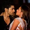
this one is clearly perfect in every way whatsoever - the pics you used are apt
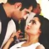
here the pic where Anshuman has his eyes closed - it sorta looks mismatched - in the above sigg - they both have this moment where they are hugging and hence have their eyes closed so it works, here she is looking at him and his eyes are closed and that too in the biggest pic of him - that could have been bettered - by the use of another pic where he is looking at her as well
Edit
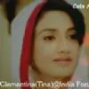
in this sigg I noticed the edge of Rudra' face in the top left corner is covered by this ball of light in your texture - faces should never ever be played with in siggs, they are after all the center of focus
Next the IshRa siggs you posted towards the very end - you mentioned the pics were of poor quality - so here' a tip for that
when you have pics you need to use but have issues with their quality make a smaller sigg, dont go for the standard PS size.
The poorer the quality of the pic, the smaller the sigg should be in its dimensions. this will help you work better - since it wont show edges or look dull make icons if you must of the pic and then make a sigg of those stacked icons - it will look better and even the quality of pics wont deter the quality of your work. the limited size will help you hide/mask the quality issue in a better way.
and last but not the least.
these siggs have one thing in common besides IshRa 😆 , you have deleted their BG - and the textures gave them a shabby look, this could be dealt in two ways- one make a smaller sigg, which automatically helps since the size wont allow you to place unwanted/additional details as it is and the second which would really work in cases like the sigg of the holi pics, where you have BG dancers whom you dont wont in the sigg.
for this use the blur method as I call it -
place the pics in the order you want them and then once you are satisfied - duplicate. This can be done with a single layer or the flattened layer of the merged images - whatever is comfortable to you.
erase the unwanted parts carefully on the topmost layer and on the bottom layer use the blur command - normal/motion/radial anything you like - and voila - it immediately makes it look pretty without jarring the image. and rem use the same coloring on both the layers - top and bottom so that it should not clash or look odd. I hope I am clear here - I have never done this before - explain stuff so its kinda new to me.
Hope you dont mind the input Madhura and once again sorry if I hurt you.
You are doing a good job, I am really impressed with your work I just brought to your attention details I think you overlooked by chance 😳


 Bhabhi Ji Ghar Pe Hain?


77