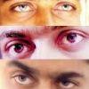
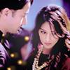
Heya~~~I'm here, after a long long time!Sanju, I missed visiting your gallery, dear. I see, you have improved :DHere are my favorites and some suggestions to improve them ;)^Nice one, Sanju :) Tip: When you use boxes to cover the texts, make sure to use lighter colors which don't stand out. I mean, they should stand out but not in neon colors. Though it's just red, it completely isolates the text from the background. For starters, you could use shades of green or blue, to match the background pictures and keep them very light so that they don't get separated. ^This is really beautiful. Exhibits your creativity :D Keep it up *thumbs up*^Good one :)^This is a real good one! Tip: Make sure to match the contrast or brightness of each image used in the edit.^This one is perfect. One of your best works :D The style matches the image :)Hope this comment helps you in some way and hopefully, you're happy that I could finally come back here.I'm happy though :DSee ya~Take care :) :*❤️With loveDidiya ;)


comment:
p_commentcount